What Is Website Architecture?
Website architecture (also called website structure) is how a site’s pages are organized. A well-structured site helps users and search engines navigate your site. Which can improve your SEO and rankings.
Here’s a visual example of website structure:
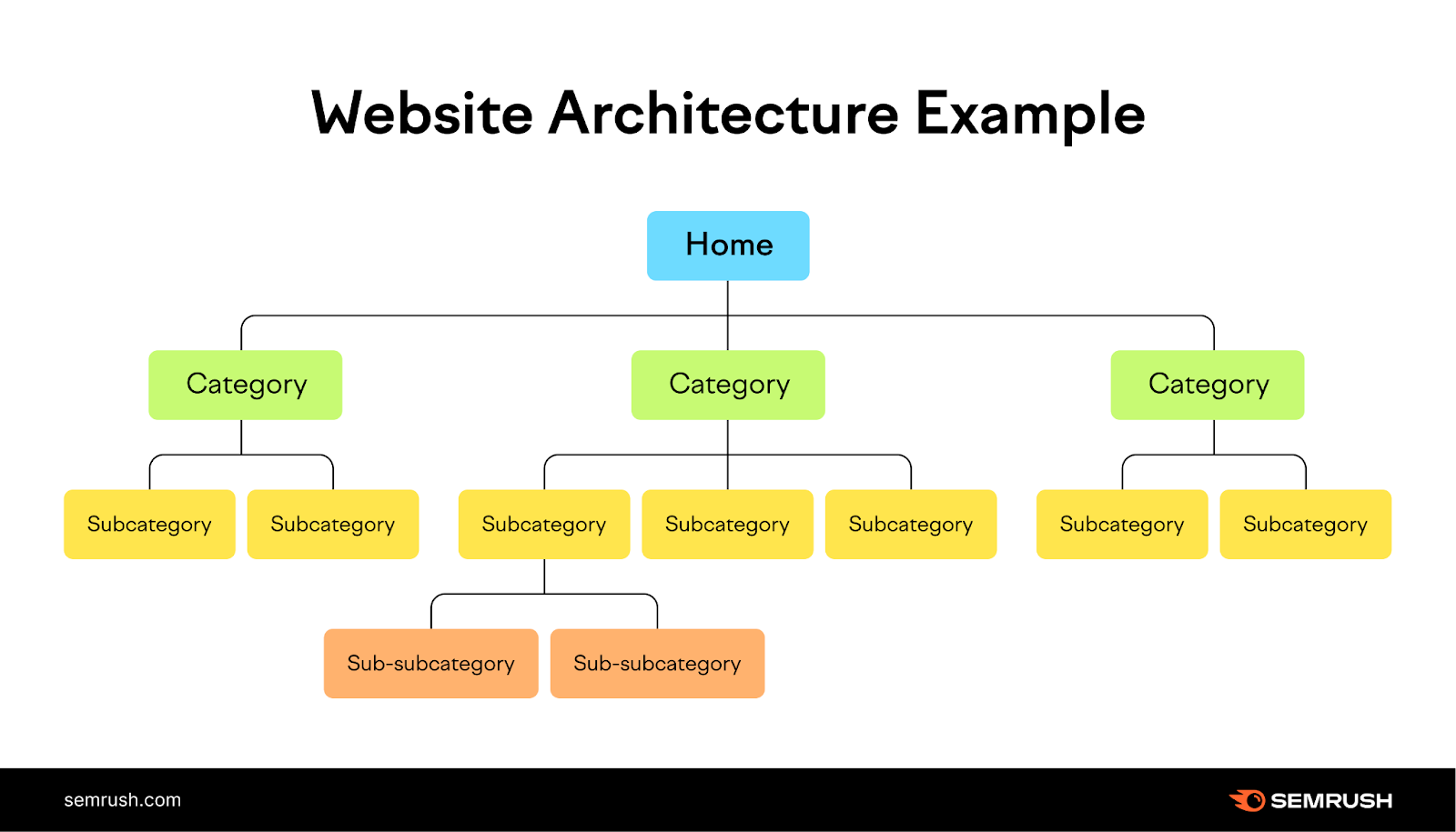
These pages are linked together through internal links—links that point to different pages on the same site. These links can be within the content, in filters or related content modules, or within the site’s menu and footer.
Why Is Website Structure Important for SEO?
Site architecture and SEO go hand-in-hand for a few reasons:
- It helps search engines find and index all your site’s pages
- It gives search engines additional context for each page
- It spreads authority throughout your webpages via internal links
- It helps visitors find the content they’re looking for
It Helps Search Engines Find and Index Your Site’s Pages
Good site architecture can help pages rank in the search results.
Google often uses internal links to find pages and then index (store) those pages in its database.
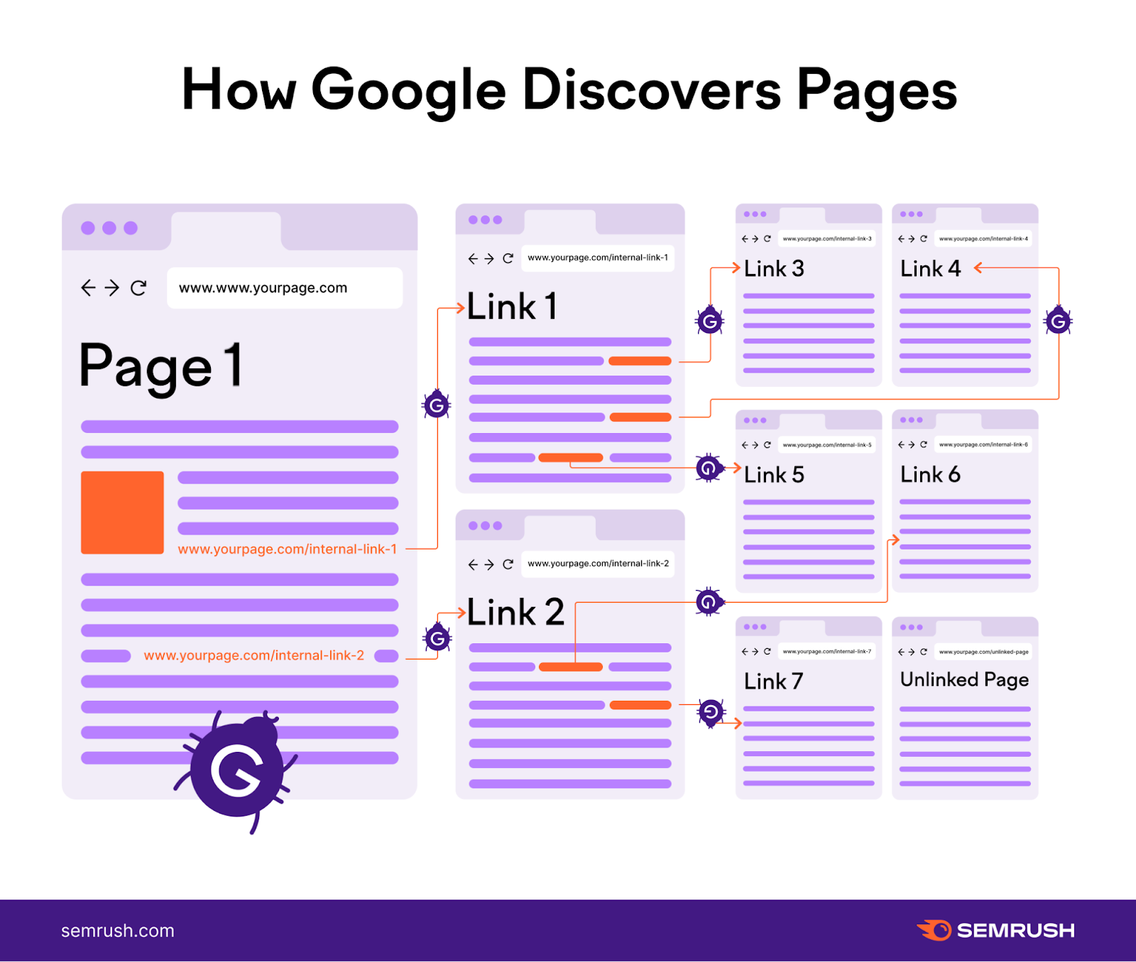
An organized site structure helps Google navigate internal links to discover new pages to add to its index. And prevents orphan pages—pages with no internal links pointing at them (which may be difficult for Google to discover and index).
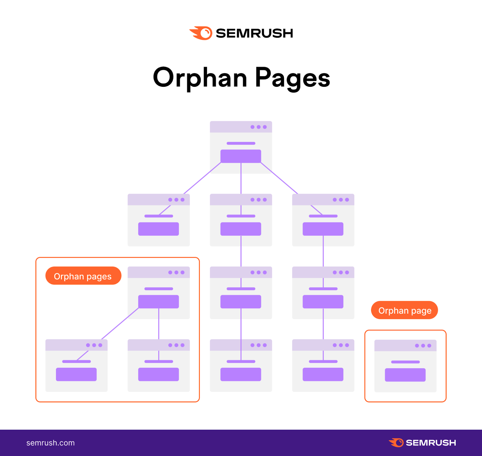
Your pages will only rank in the search results—and drive traffic—when they are in Google’s index. Which you can achieve through a well-structured site.
It Gives Search Engines Additional Context for Each Page
Additional context helps search engines understand which queries to rank each page for.
For example, say you sell pet supplies. And you have different pages for animals like dogs, cats, and rabbits.
Search engines can understand which toys are for which types of animals based on the pages they link to and from. And from the anchor text (the clickable text in a link).
This toy (pictured below) doesn’t have the word’s “dog toy” in the title. But it’s linked from a “dog toys” page. So, search engines may know to place it in the search results if someone searches queries like “dog toys.”
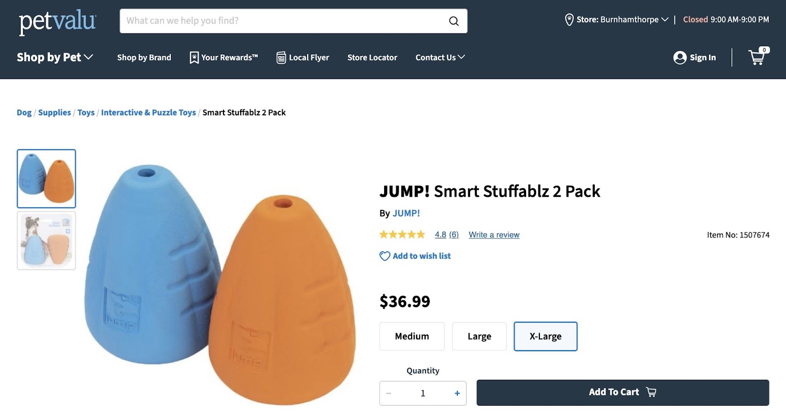
However, search engines may struggle to understand the purpose of each webpage if your website’s structure isn’t straightforward. The lack of a clear context might harm your organic rankings.
It Spreads Authority Throughout Your Webpages
PageRank is a Google algorithm that measures a page’s authority based on the quality of backlinks—links from external sites—that point to that page.
And important pages (typically pages with lots of quality backlinks) can pass some authority down to the other pages they link to.
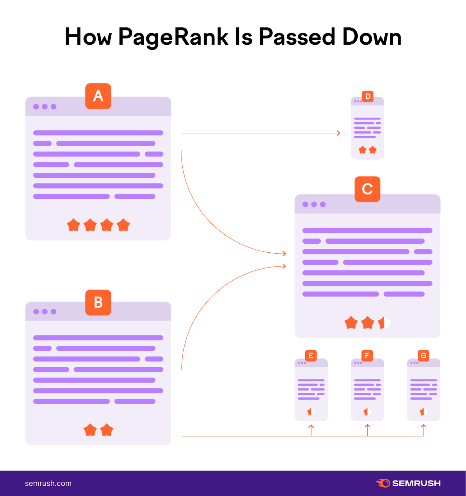
This might help pages with less authority rank higher. So you can drive more traffic to them.
It Helps Visitors Find the Content They’re Looking For
A good site structure can improve user experience. And there’s a higher chance users will click around your site when the experience is good. Which may turn more casual visitors into leads or customers down the road.
And you should plan your website’s structure so users can easily move down your marketing funnel by navigating to pages like products, services, and other important pages.
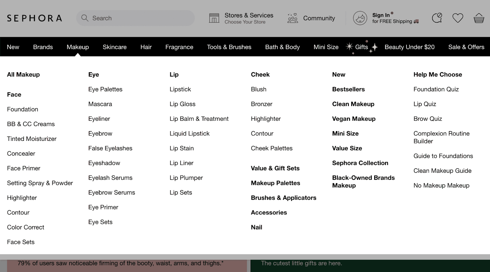
Sephora, for example, does this well.
The makeup website’s user-friendly navigation menu groups their products into well-known categories (e.g., Makeup, Skincare, Makeup for Eyes, etc.). That way, shoppers can find the products they want in a few clicks.
What Does a Good Site Architecture Look Like?
The best website structures are flat, group topically relevant content together, and don’t have any orphan pages.
Let’s discuss each point in more detail.
Flat Website Architecture
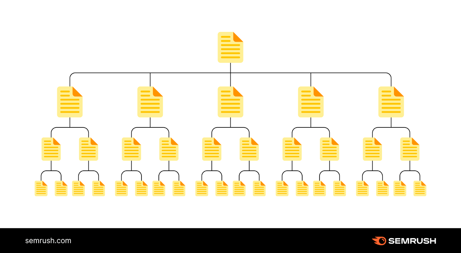
A flat website architecture is when users can access your content in as few clicks as possible.
This way, users don’t need to work too hard to find the content they want. And less user effort can lead to a better user experience.
Here’s a flat site architecture diagram:
And this is an example of deep website architecture (where users need to click more to access certain pages):
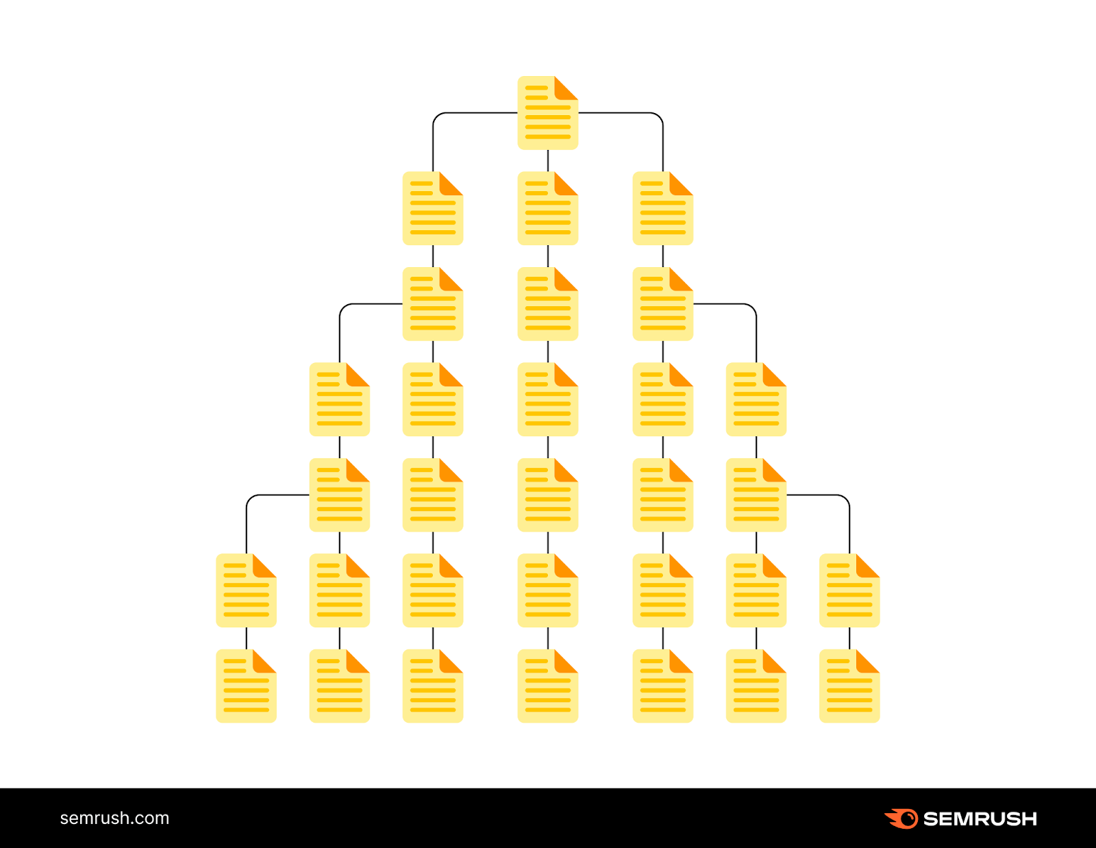
The ideal click depth (the number of clicks it takes to reach any page on your site) is three clicks or fewer. So, look to keep your site architecture to three clicks or less as you design the architecture for your website.
Group Topically Relevant Content Together
Grouping topically relevant content—content within a specific topic—helps search engines find your pages. And see how different pages connect to one another.
It also helps you build topical authority (your expertise on a subject).
Strong topical authority can improve your rankings in the search results. So you drive more organic traffic to your site.
No Orphan Pages
Search engines travel the web through links. So they may struggle to access—and rank—orphan pages. And users can only access orphan pages by directly visiting the URL.
So, orphan pages can hurt your site’s SEO and user experience.
You can find orphan pages on your site by heading into Semrush’s Site Audit.
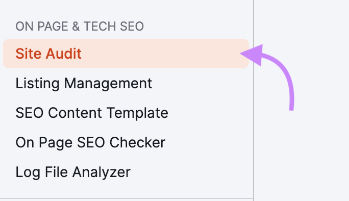
Enter your domain and click “Start Audit.” (Or click “Create project” if you don’t have a project already set up.)

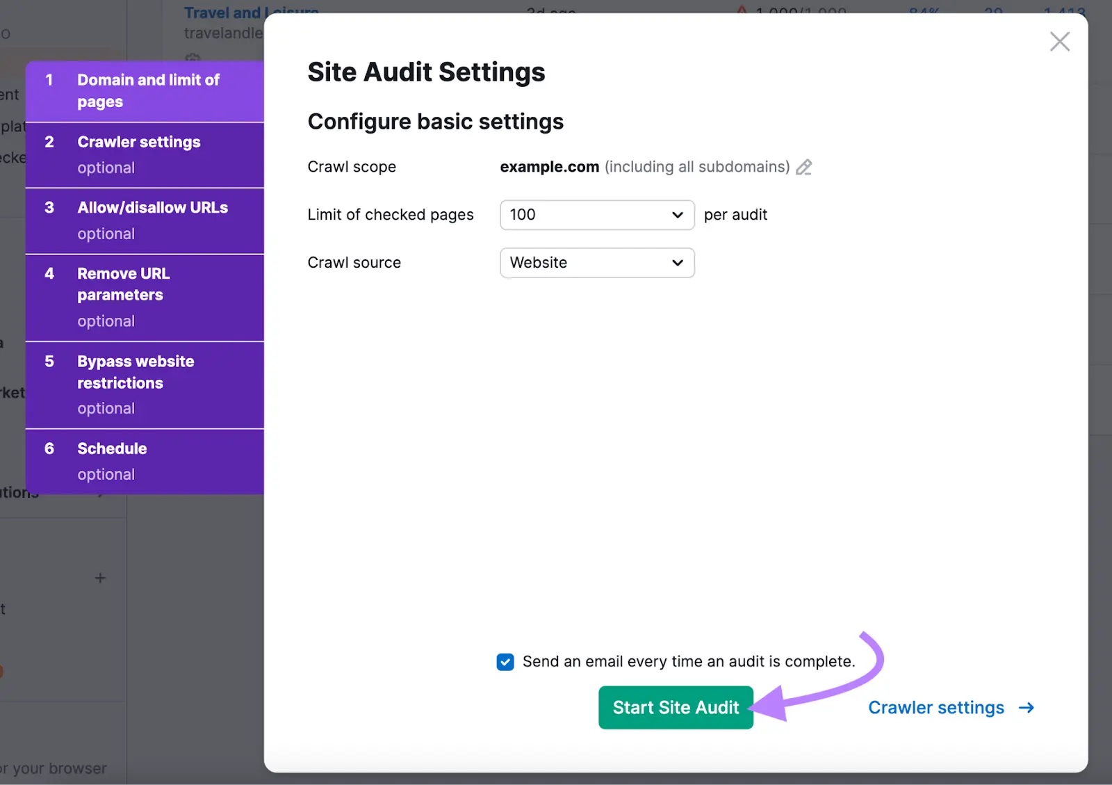
Configure your Site Audit settings (our configuration guide can help you if you get stuck). And click “Start Site Audit.”
Click “Issues” when the Site Audit is complete.
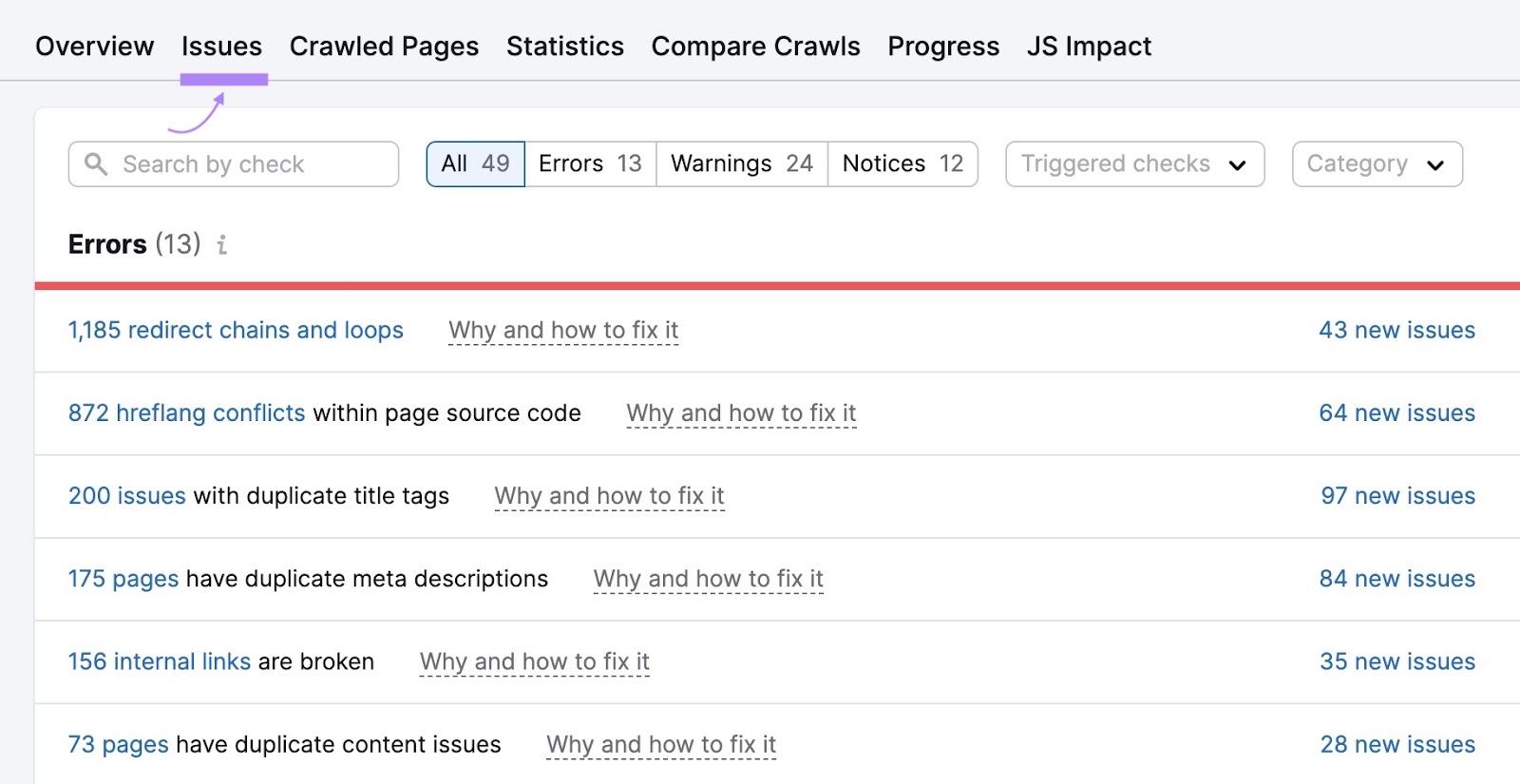
And type “orphan” into the search bar to bring up a list of orphaned pages. Click the “# orphaned pages” link to view the pages.

Identify relevant pages to link to each orphaned page. This will help users and search engines easily find these pages in the future.
9 Website Architecture Best Practices
These tips will help you create a strong site architecture to improve your SEO and user experience:
1. Use the Right Type of Structure for Your Site
There’s no one-size-fits-all approach for website structure. And how you choose to organize your site depends on things like the size of your site, its goals, and your users.
An ecommerce site might choose to organize their website architecture by product categories. Like book retailer Indigo does:

And to display products, you might decide to paginate results (i.e., display products or search results on separate pages).
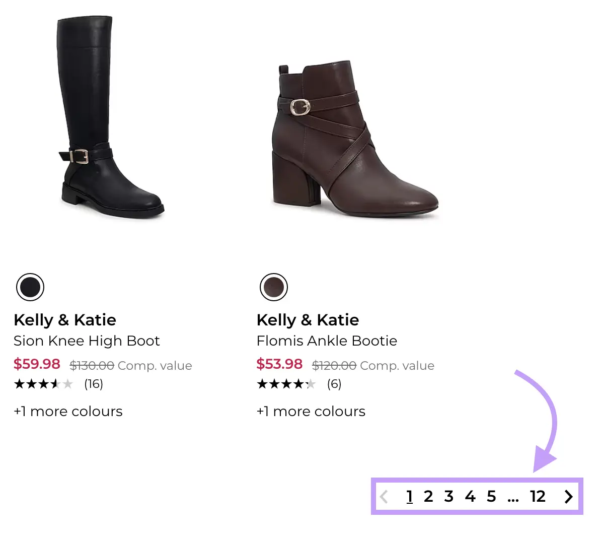
Pagination offers more internal linking opportunities. Which can help search engines further understand how your pages connect to one another.
And content sites might choose to structure their site based on different content categories. Like Business Insider:

Unsure which approach is best for you? Look at your competitors and see if there are any commonalities among them.
The way competitors structure their sites can give you ideas on how to structure yours. Plus, users might expect a similar site structure when visiting similar sites. For ease of navigation and familiarity.
2. Plan the Information Architecture of Your Site
Information architecture is the process of structuring and organizing content. One way to organize your content is through content pillars and topic clusters.
Content pillars are your main, broader categories of content. And clusters are your subcategories that support the pillars.
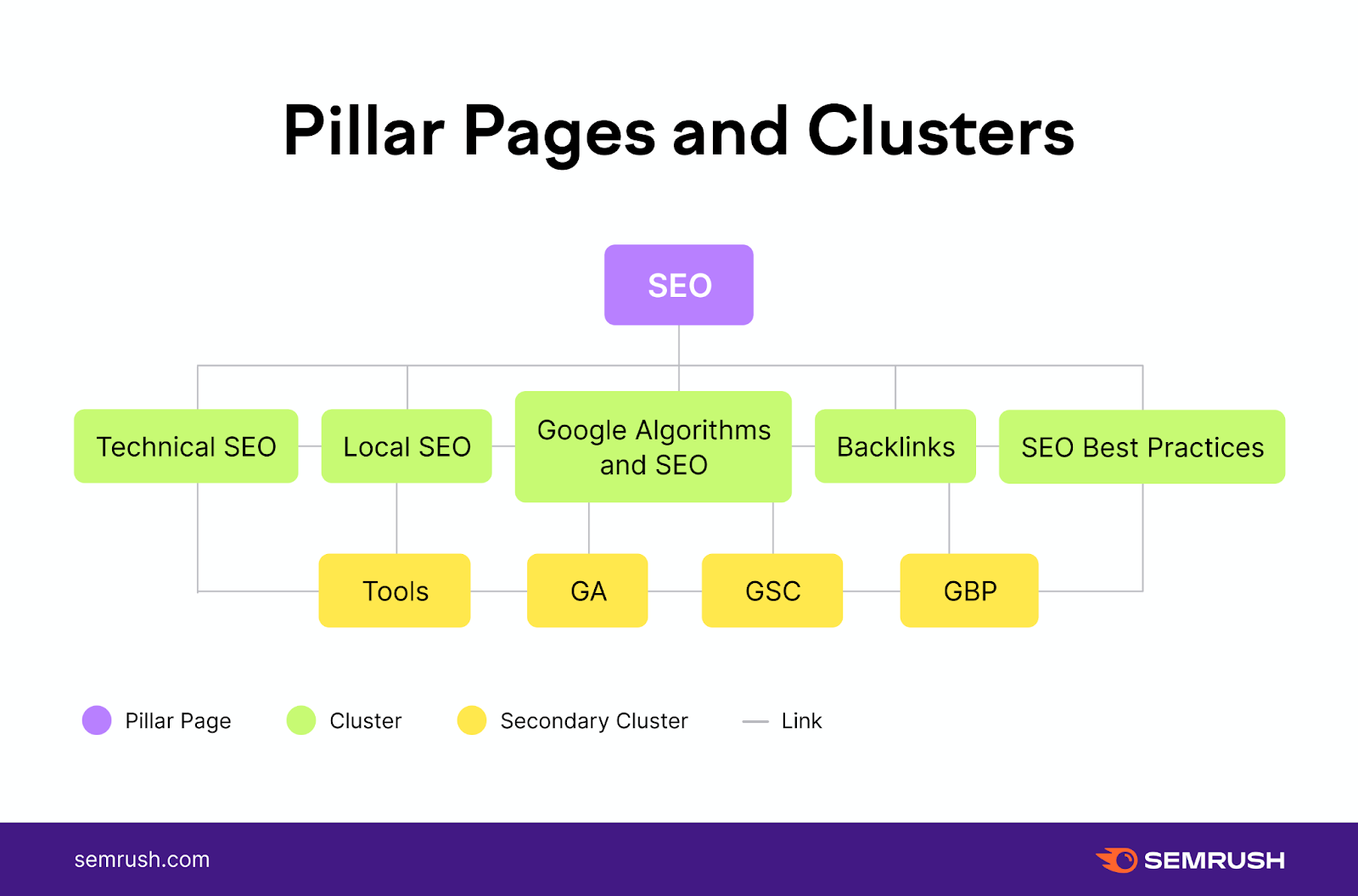
Say you wanted to create content clusters about different types of marketing. Like email marketing and digital marketing.
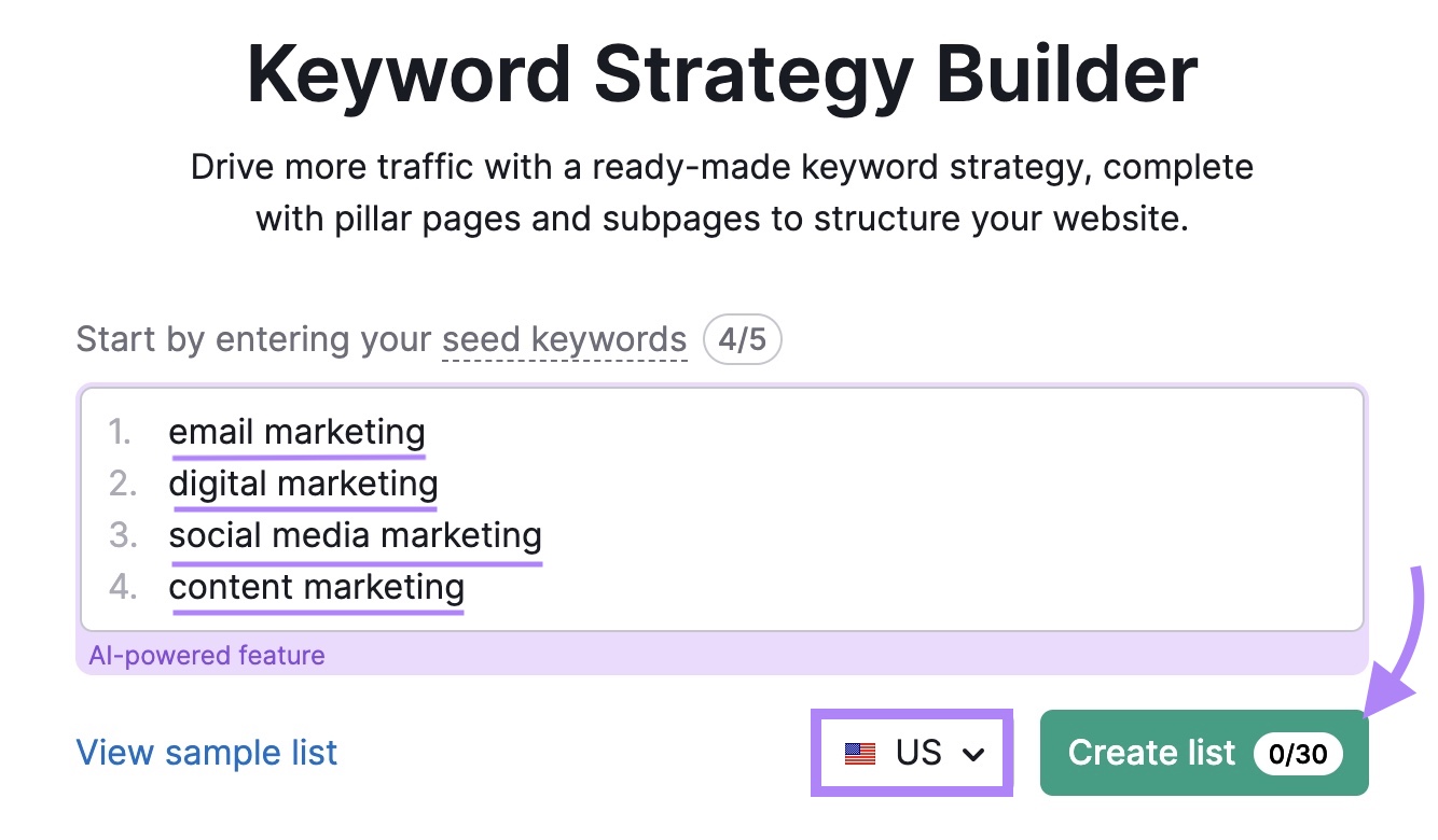
To build out these content clusters, open a keyword research tool like the Keyword Strategy Builder.
Enter your seed (broad) keywords. In this case, we’ll use “email marketing,” “digital marketing,” “social media marketing,” and “content marketing.” Lastly, select your country in the drop-down and click “Create list.”
The tool will analyze each seed keyword and give you pillar page ideas with lists of relevant subpages.
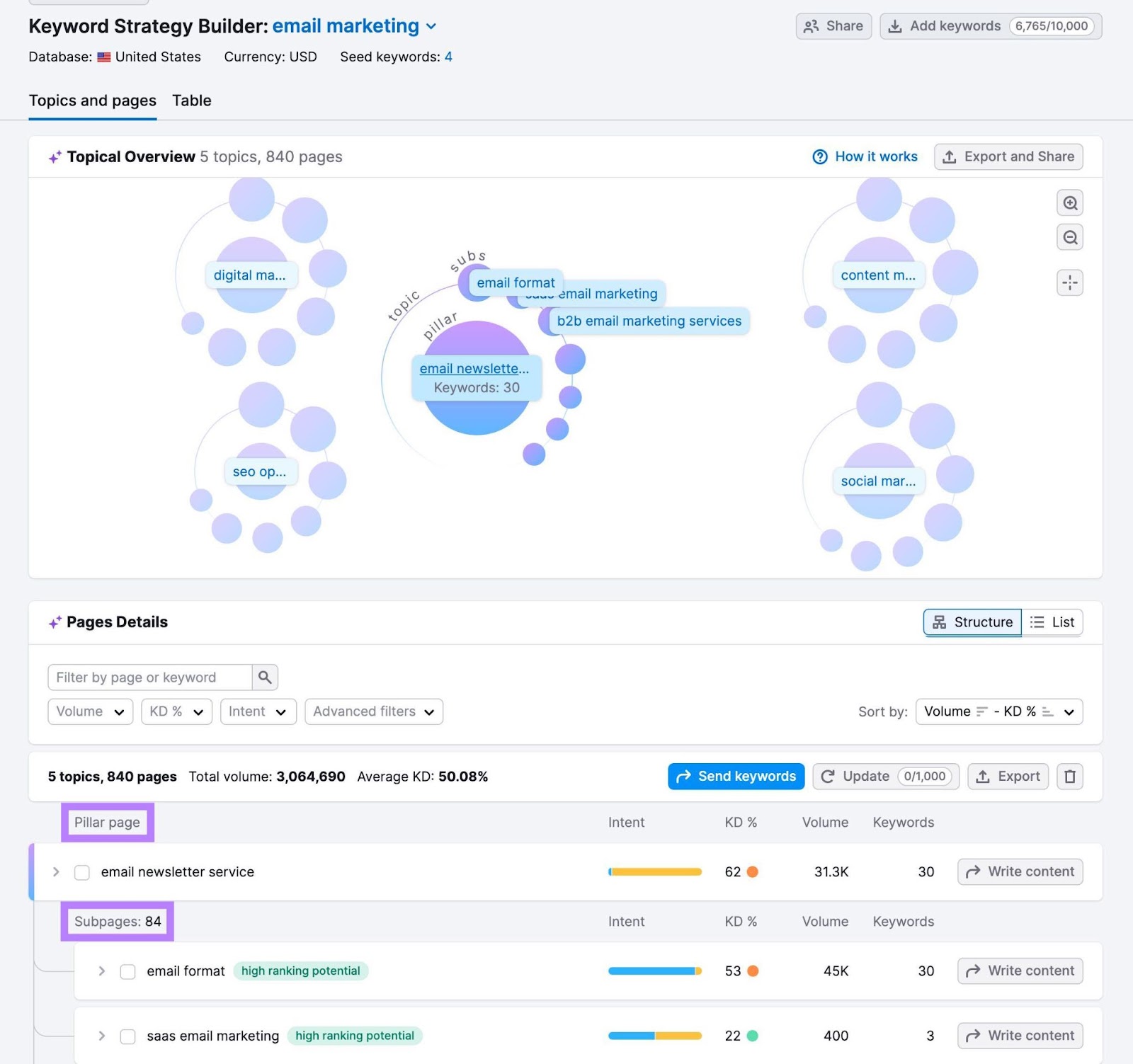
Go through the different suggestions and pick which ones you’d like to create content for.
For example, you might create a topic cluster for “digital marketing” that has these subpages:
- Digital marketing campaign examples
- Benefits of digital marketing for small businesses
- Types of digital advertising
- Digital marketing framework
- Digital marketing elements
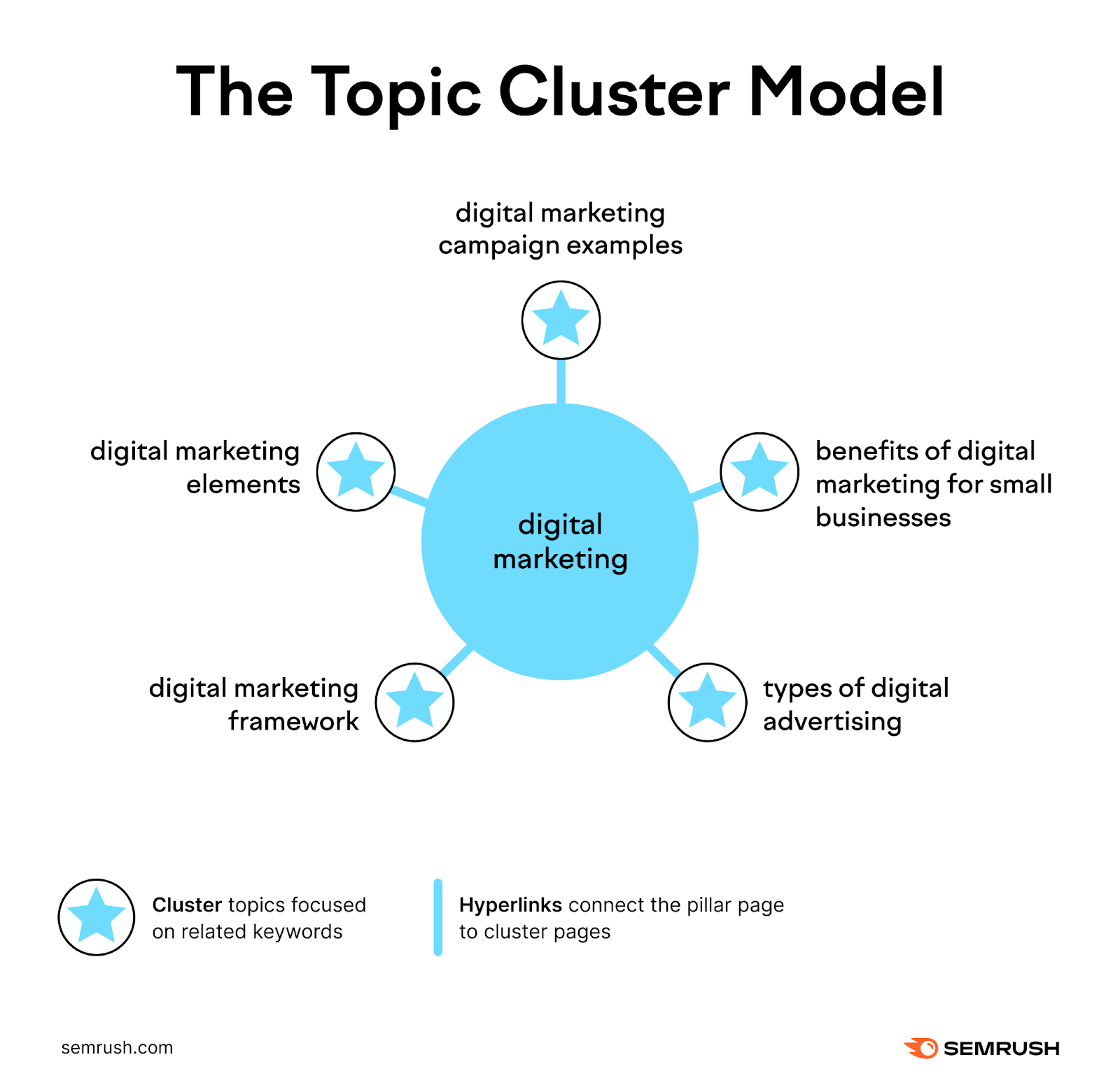
Follow this process for each pillar page you want to create.
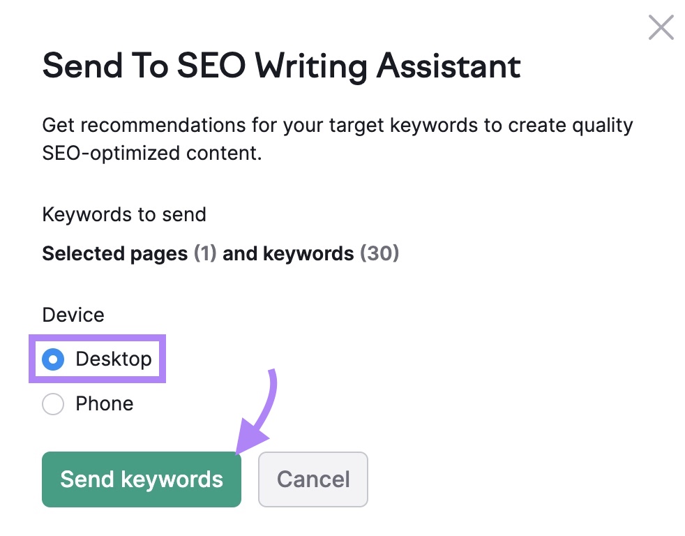
Then, write content for each selected page by clicking “Write content.”

Choose which device you’d like to write content for (e.g. select “Desktop” if most of your audience reads your content on a desktop). Then click “Send keywords.”
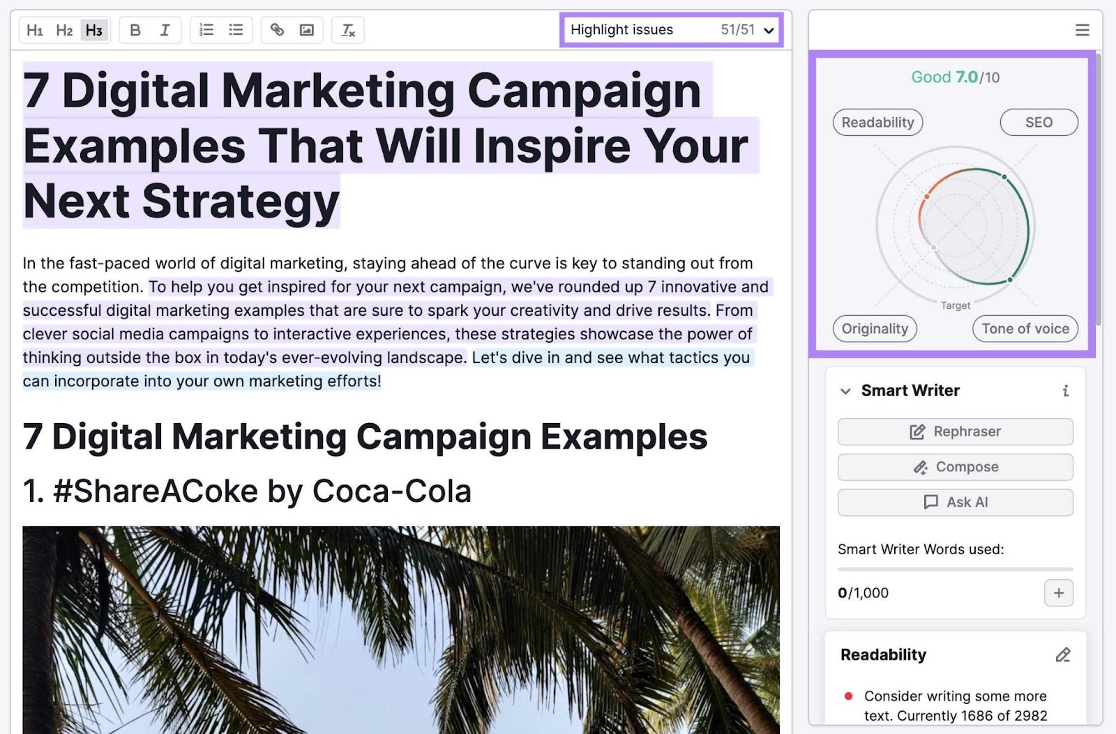
This opens Semrush’s SEO Writing Assistant—an AI-powered editor that gives you tailored suggestions on your content’s readability, SEO, tone of voice, and originality. To help it rank higher in the search results.
After writing each piece of content, use internal links to link your homepage to the pillar page, the pillar pages to one another, and the relevant pillar page to its topic clusters.
3. Use Internal Linking Strategically
When you link from one page to another, you convey to search engines (and users) that the two pages are related. Which helps search engines determine your site’s structure. And users navigate your site.
Links also pass authority, so it’s good practice to link to relevant, important pages on your website.
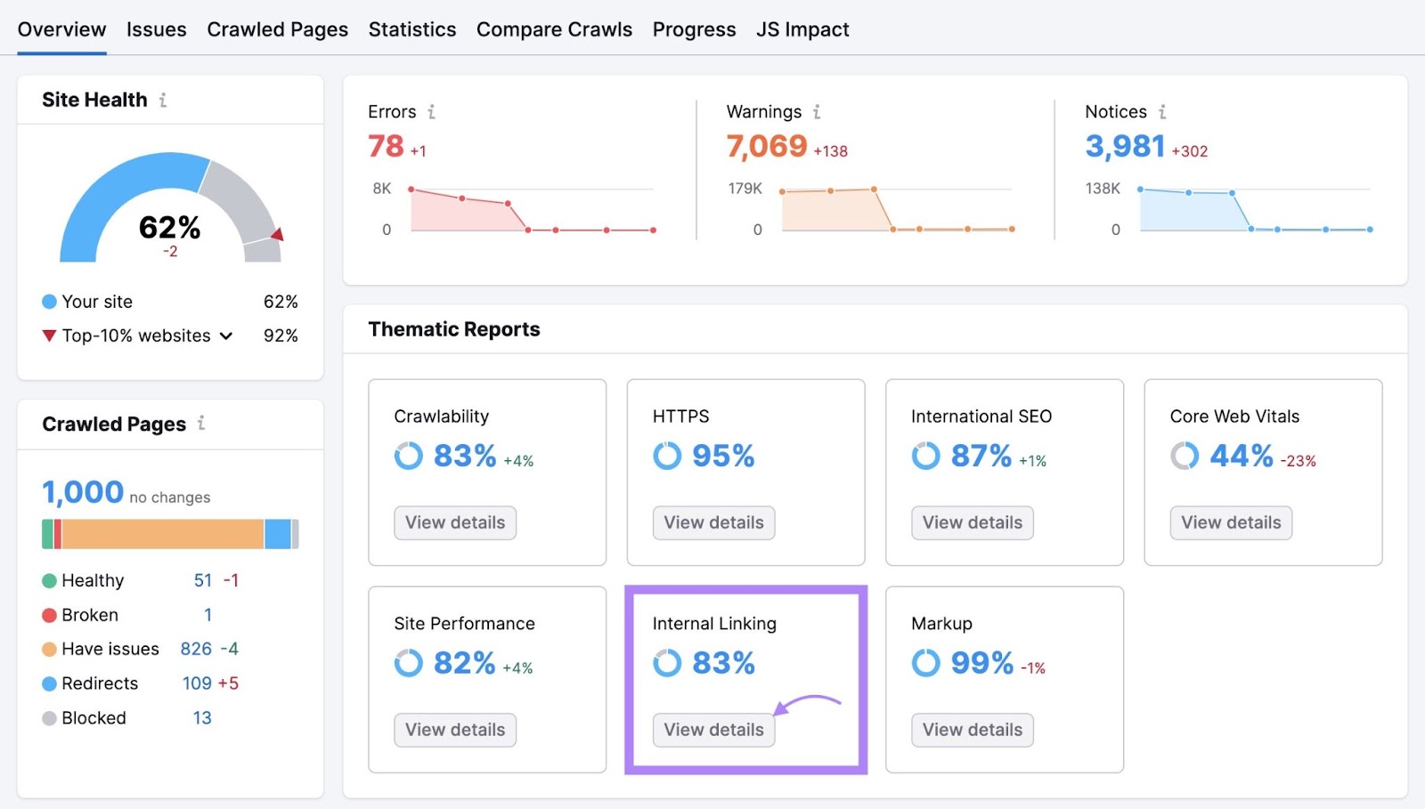
Use Site Audit to fix any issues with your internal linking—like broken internal links that prevent users from clicking around your site.
Open your Site Audit report and click “View details.”
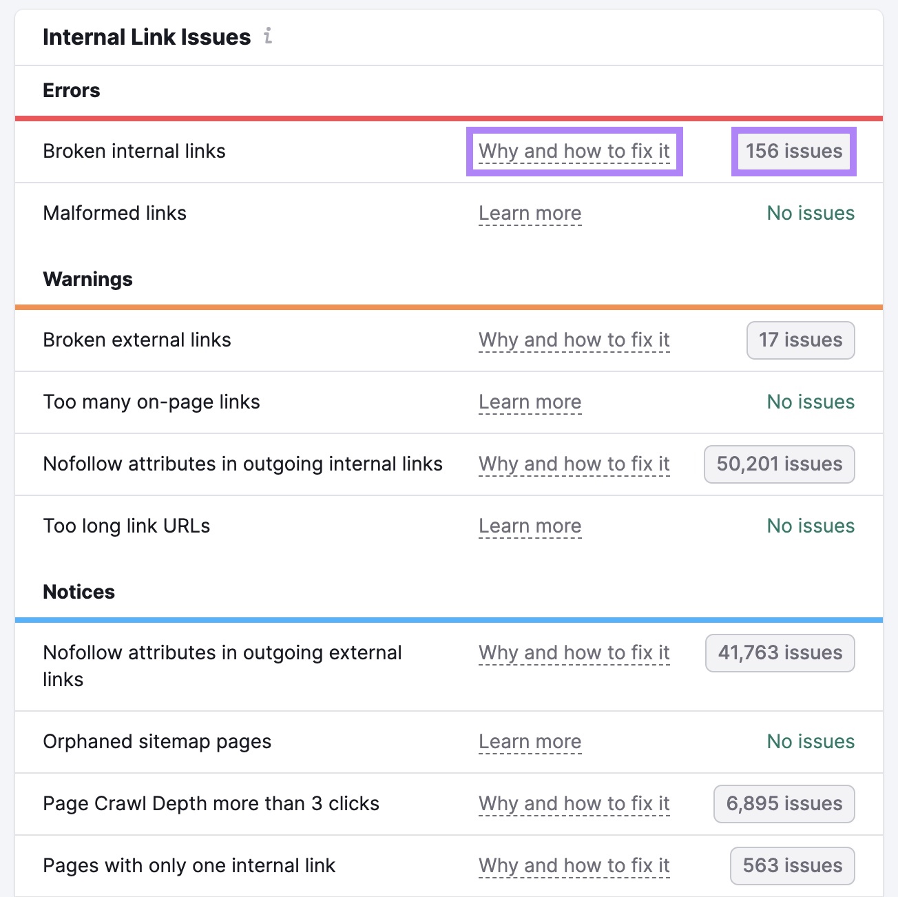
Review—and fix—any internal link issues by clicking the “# issues” button. You can also click “Why and how to fix it” to get tips that will help you fix each issue.
And review the “Pages passing most Internal LinkRank” widget. Internal LinkRank is a Semrush metric that quantifies the authority of your site’s pages.
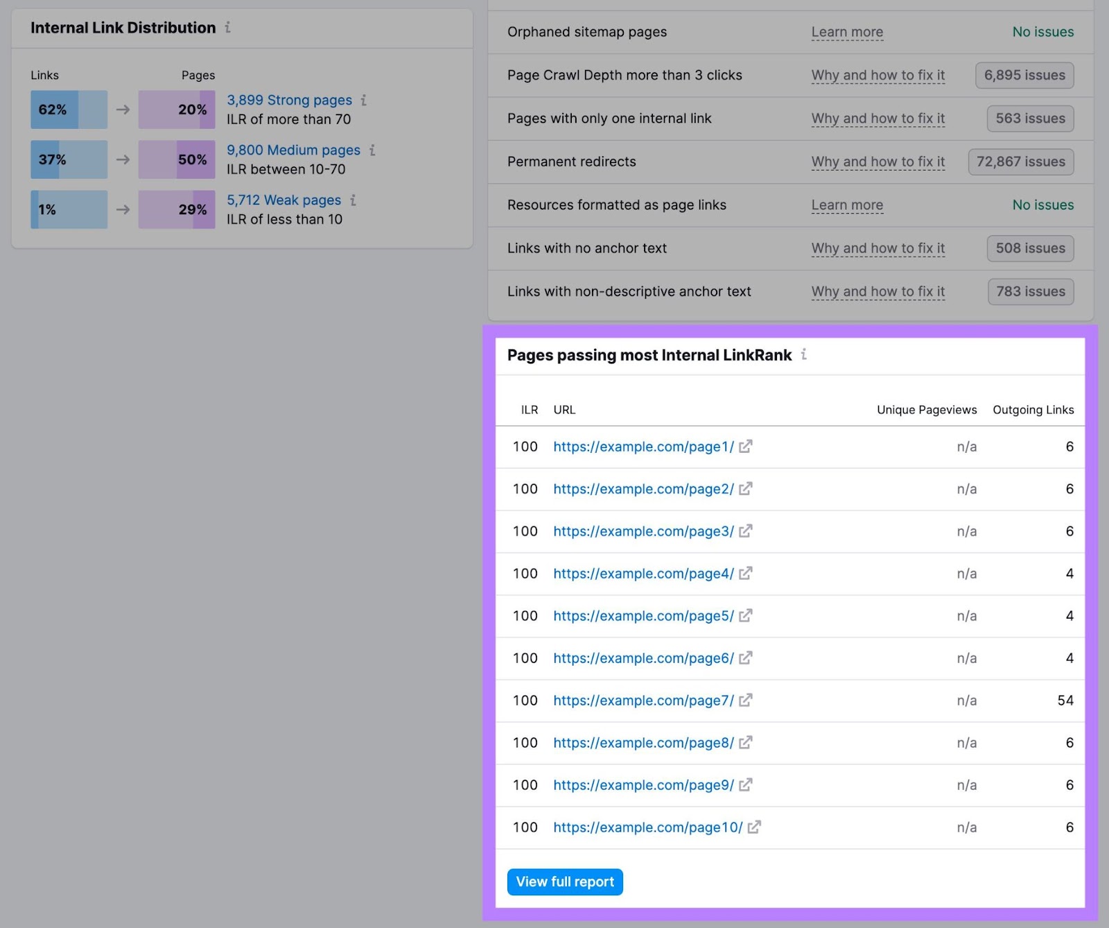
You might consider placing pages with high authority near the top of your site architecture (if it makes sense). So they can pass down authority to smaller pages.
4. Make Sure Users Can Access Your Pages in Just a Few Clicks
Users should be able to access content on your website in as few clicks as possible (ideally three or fewer). Even if you run a large ecommerce site with a million pages.
The depth of your architecture also affects how search engines crawl your site. Search engines navigate websites through links. So the lower the crawl depth, the quicker (and more likely) search engines can navigate to a webpage.
You can use Site Audit to find out which pages on your site require more than three clicks to access.
Hit the button beside the “Page Crawl Depth more than 3 clicks,” in the “Notices” section of the “Internal Linking” report.
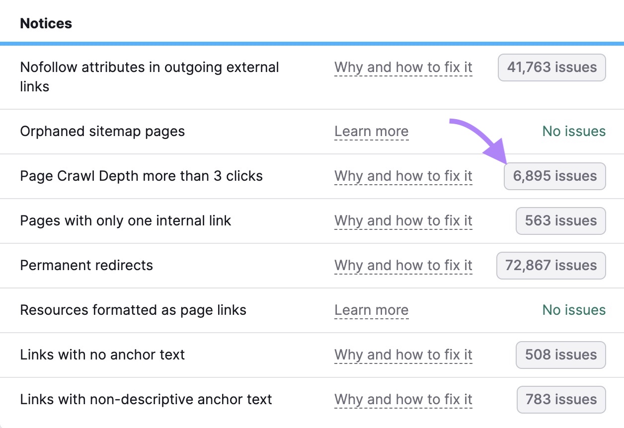
You’ll get a list of pages that require too many clicks to access.
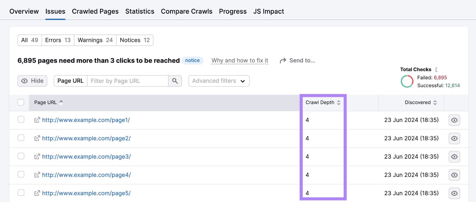
Consider simplifying your site structure for pages that take four or more clicks to visit.
5. Use Categories and Tags
Sites that publish blog posts should consider using categories and tags to group relevant blog posts together. Users and search engines can use these groupings to navigate your site and find relevant content.
Categories broadly group posts. For example, Semrush’s blog has three main categories: “SEO,” “Marketing,” and “News & Research.”
And each category has different subcategories. Like “Keyword Research” and “On-page SEO” for the main “SEO” category.
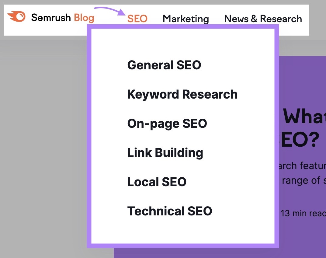
There are a variety of ways to choose blog categories:
- Review your site’s content and determine which topics you write about the most. Turn these main topics into your categories.
- Use pillar page topics to form categories
- Analyze competitor blogs and model your categories off the ones they use
- Use Semrush’s Keyword Strategy Builder tool to generate category ideas
- Organize content by type (rather than topic). Like “how-to guides,” “tutorials,” and “case studies”
Tags, on the other hand, often join categories together.
For example, say you have a website about hiking. You might use categories for topics like places to hike, gear, and tips. And you might use tags to group together content for specific readers. Like content for beginners and content for advanced hikers.
6. Optimize Your Site’s URLs
It’s important to keep URLs clear and consistent. Because Google uses them to understand the hierarchy and structure of your website.
A good URL is short, contains your main keyword, and is easy for users to understand. Here’s an example of an optimized URL that clearly communicates the topic of the page:

And here’s an example of a poorly optimized URL that users (and search engines) may find confusing:

Before publishing your page, ensure the URL is concise and clearly explains what your page is about.
It’s easy to keep a consistent URL structure when you use your content pillars and clusters for reference.
For example, pillar page URLs could follow the format yourdomain.com/pillar-topic/
And your cluster page URLs could be yourdomain.com/pillar-topic/cluster-topic/
Here’s what that could look like if we use the “digital marketing” example from above:
- Pillar page: yourdomain.com/digital-marketing
- Cluster subtopic page: yourdomain.com/digital-marketing/framework
There are usually three menus to consider:
- Header navigation
- Footer navigation
- Mobile navigation
Additionally, some sites might also have secondary navigations or contextual navigations that change based on the content type or whether users are logged in.
And while there’s no one right way to structure your menu, it’s best to keep your site easy to navigate. So customers can find important pages and (hopefully) convert.
Here are some tips:
Using a navigational menu is an easy way to connect pages and reinforce your site structure. Because menus are simply collections of important links.
There are a few different types of navigation menus to choose from.
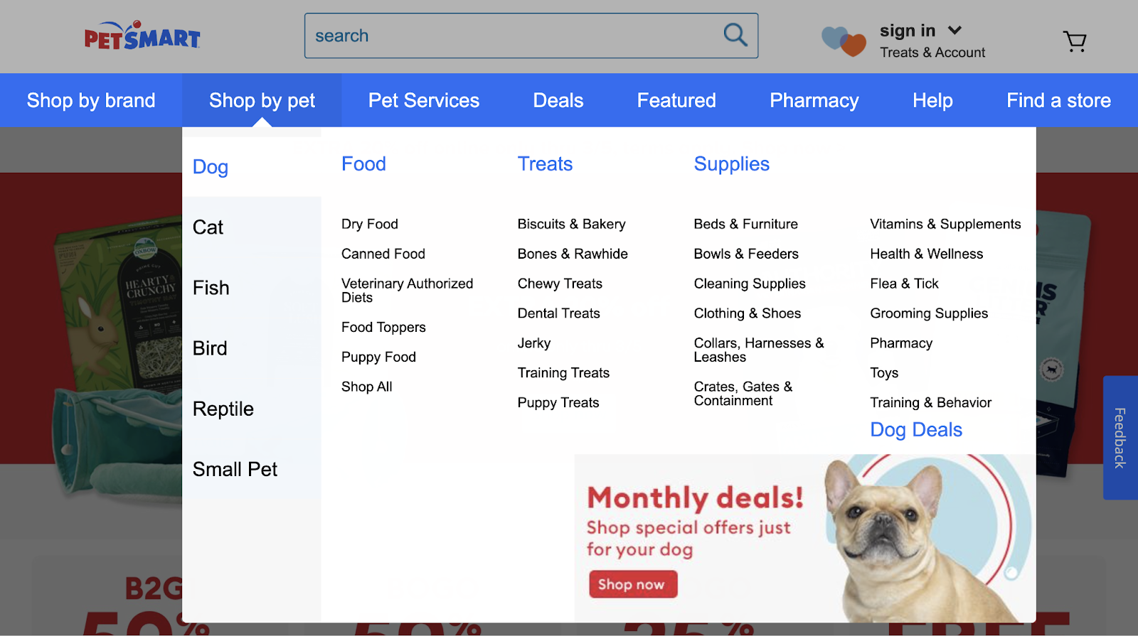
Like a drop-down menu, which works well for sites with lots of content. You can highlight many pages while still providing a clear path for the user.
Or a straightforward horizontal menu:

Horizontal menus work well for smaller sites and should provide categories users expect (like “Shop,” “Contact,” “About Us,” etc.).
You can also opt for a vertical sidebar navigation menu:

This option is similar to a horizontal navigation menu. While it can provide more real estate for top-level navigation links, it can take up valuable space on your site. And could cover important content that you don’t want users to miss.
Footer navigation appears at the bottom of websites:
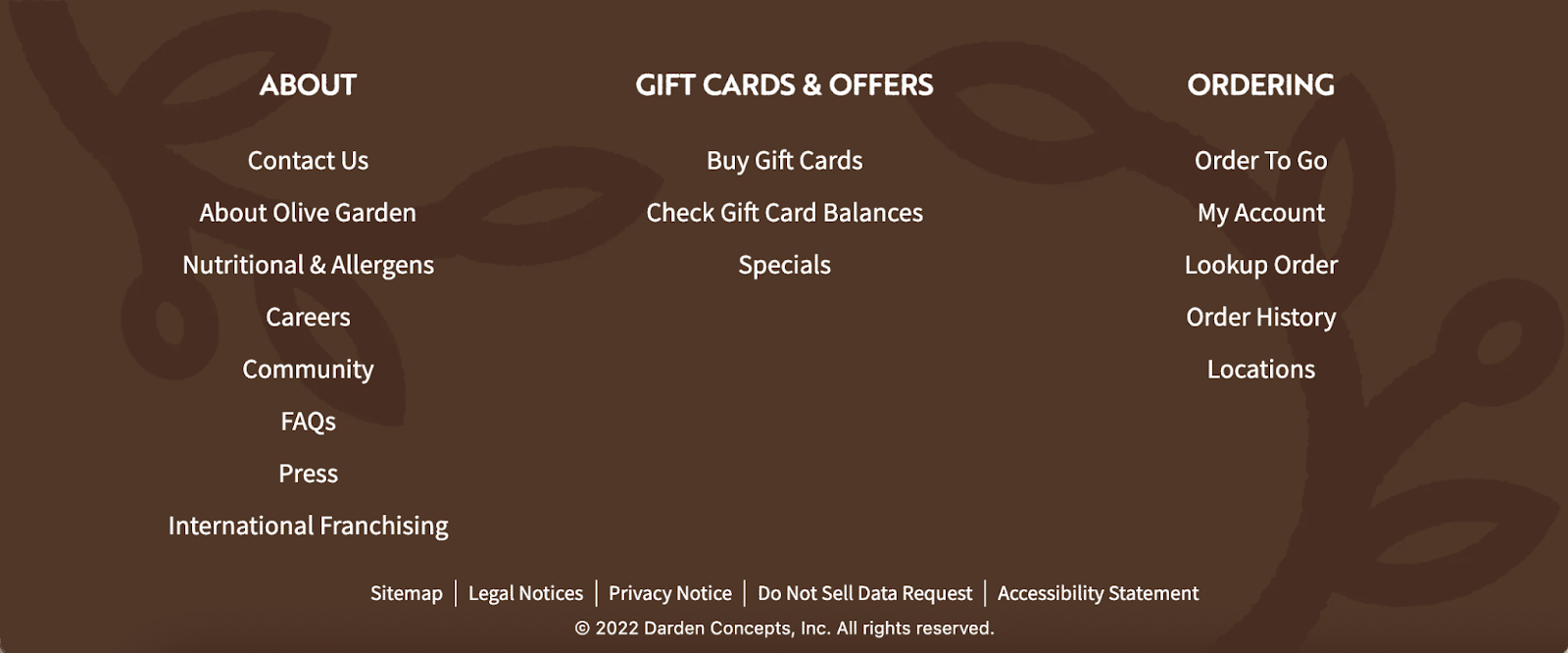
Consider using your footer navigation to house important links that aren’t related to your main categories but are still useful for your user. Like press links, informational content about the company and their policies, or links to your contact page.
Mobile Navigation
Google uses mobile-first indexing. Which means Google prioritizes indexing the mobile version of your site.
So, pay attention to your mobile site’s navigation. And make sure it’s as intuitive as the desktop version.
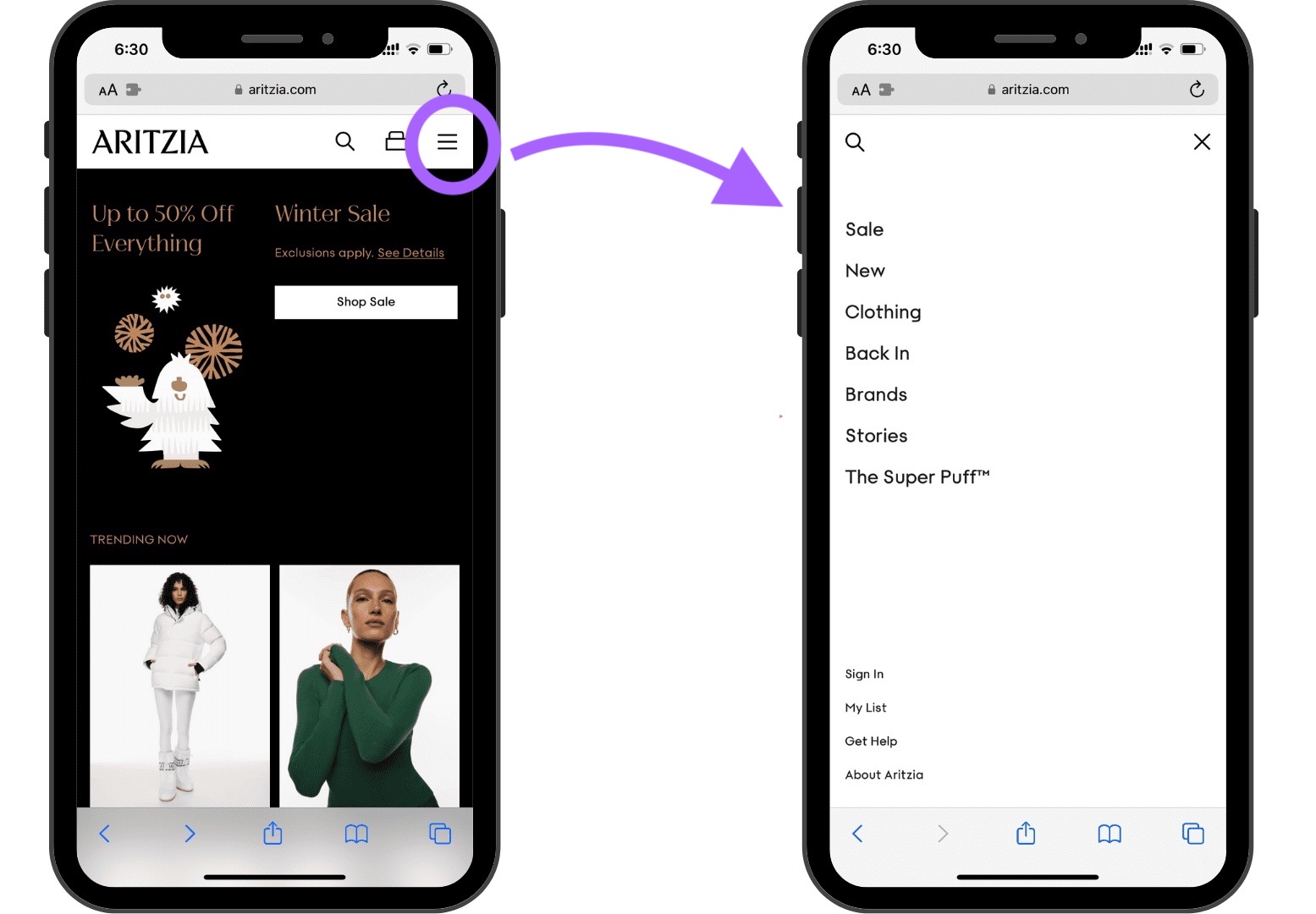
Hamburger navigation menus are a popular option on mobile devices. This type of navigation appears vertically on smaller screens.
Like this:
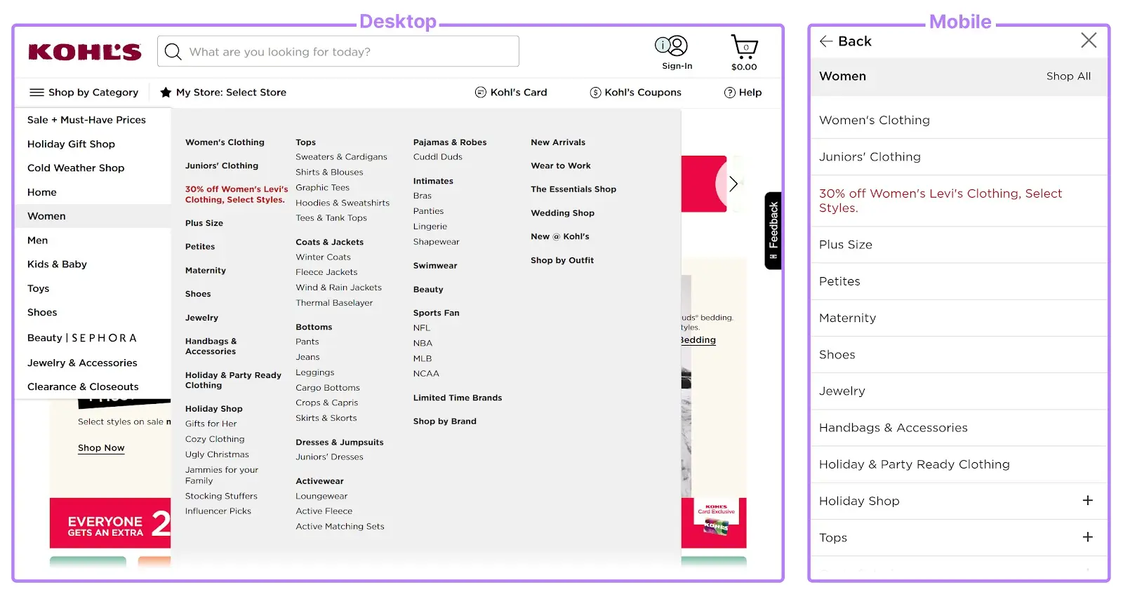
Retailer Kohl’s condenses their desktop menu to include the same links in their scrollable mobile menu. Users can still access the same pages on mobile devices (and search engines can crawl the same ones, too).
8. Use Breadcrumbs
Breadcrumb navigation is a text-based navigation path made up of links. It shows users where they are in your site structure.
Breadcrumbs also communicate to search engines how your site is structured.
They show the route to the page a user is on and look like this:
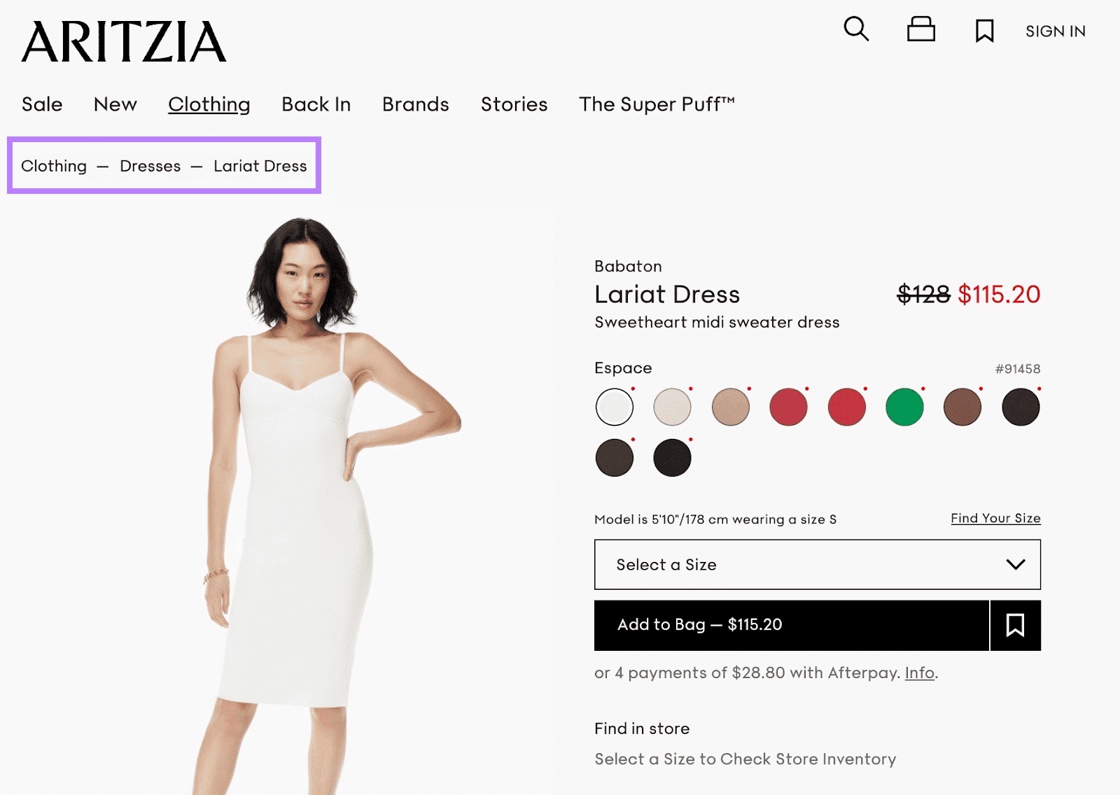
When users click through your site, they don’t always navigate directly to the product they eventually buy or the content they eventually read. So it’s helpful to show their navigation path, in case they need to backtrack.
9. Use HTML and XML Sitemaps
A website sitemap is a file that shows all the pages, images, videos, and files on your website.
It shows how different parts of your site are related to each other in a crawlable format for search engines.
An HTML sitemap is designed for users. So if they can’t find a certain page, they can view a full list of every page on your site.
Like this:
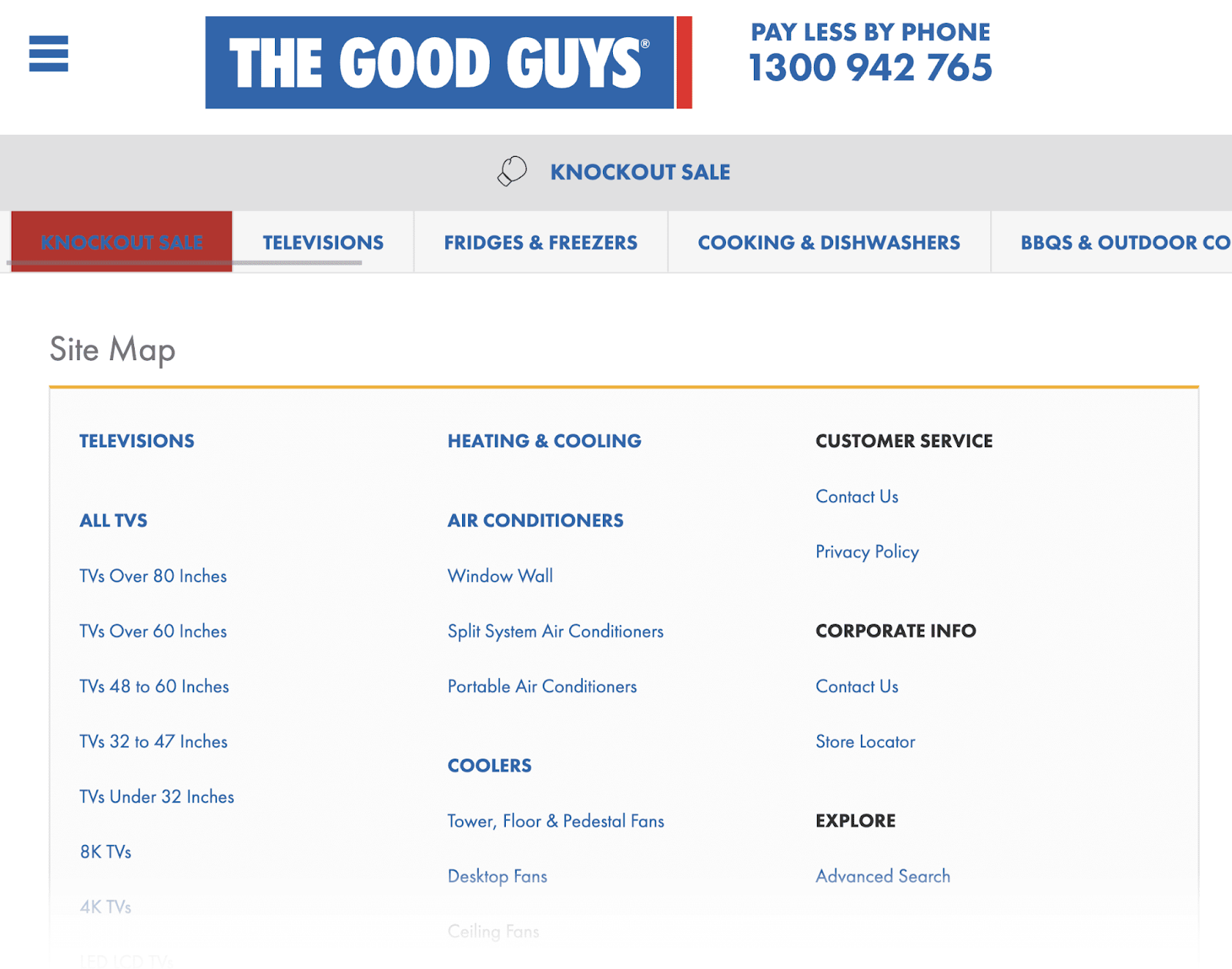
XML sitemaps, on the other hand, are created with search engines in mind. They show a full list of URLs in plain text so crawlers can easily access them.
Here’s an example of an XML sitemap:
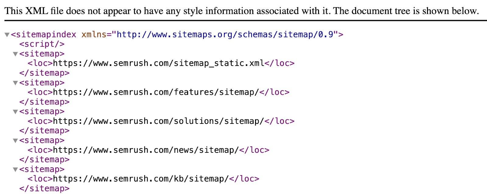
You should create different sitemaps for different sections of your website (like products, blogs, and categories). As multiple sitemaps can create hierarchy and improve crawlability.
If your sitemap has errors, it may mean search engines are unable to find or process certain webpages. And search engines may choose to ignore pages they can’t process. Which could lead to issues with ranking.
To find XML sitemap issues, go to the “Issues” tab within the Site Audit tool. Then search for “sitemap” in the search bar.
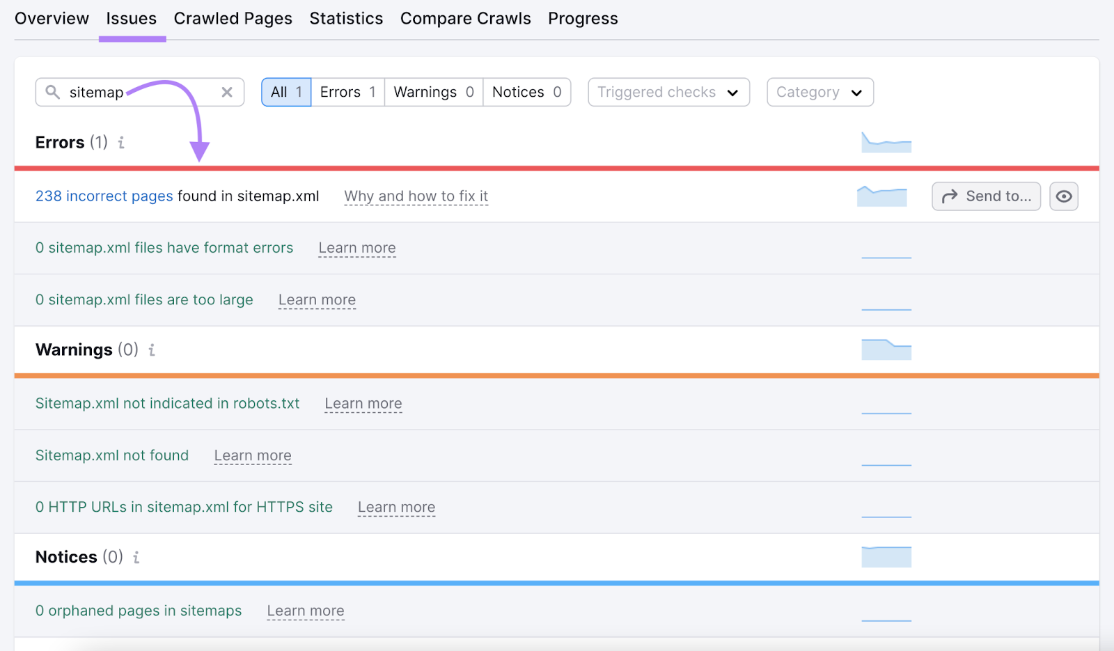
That should pull up a list of potential XML sitemap errors, like formatting errors and incorrect pages.

Click “Why and how to fix it” to get tips for fixing each issue.

After fixing each issue, submit your sitemap to Google through Google Search Console. So Google can find all the pages on your site without running into errors.
Take the Next Steps to Improve Your SEO
Defining your website’s architecture will benefit your users and search engines. And can improve your SEO to help you rank higher.
Not sure where to start?
Here’s what we suggest:
- Use Site Audit to check for internal link issues, orphaned pages, and review pages with the highest Internal LinkRank score (your most authoritative pages)
- Develop content clusters and pillar pages with the Keyword Strategy Builder tool
- Map out your page and use the site structure to inform your site’s navigation
Ready to improve your site’s architecture? Try Semrush for free today.


