Summary in a nutshell:
Google seems to be testing how its summarized sources carousel appears in SGE responses by showing different versions to different people (Google accounts).
From our point of view, this means they’re checking if the summarized carousel is useful or not, especially when Google already provides direct answers that might make the carousel unnecessary for some searches/queries.
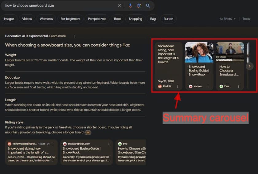
During our in-depth analysis of SGE, we’ve observed a noticeable trend: the sources carousel on the right appears less frequently.
Below on the screen is the carousel I am talking about.

What’s behind this change?
I explored some of the queries, such as:
- How to choose a snowboard size
- What is a gravel bike?
- Indexing in SEO
- How to find a unicorn
- how to choose a mouse for remote work
- restaurants near me
- what to watch
- pain in throat
Initially, I believed this reduction was a global adjustment in SGE, noticeable by everyone, and I was to prepare a bigger analysis. However, after discussing it with our team, we uncovered that these changes weren’t universally visible, suggesting Google might be conducting A/B testing.
One of our thoughts was maybe Google is changing the layout based on the user’s location. However, after changing locations via VPN, the layout remained unchanged. This led us to assume that the way SGE presents results is likely related to the Google account.
Different account, different layout – examples of SGE responses
Here is an example where different Google accounts show different SGE layouts.
Although the responses looked identical, for the first Google account, the carousel on the right with summarized sources is missing.
Query: how to choose a mouse for remote work
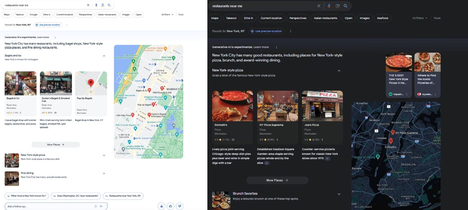
Left – Google account 1 (missing carousel on the right), right – and account 2 (carousel displayed).

Here is another example for other query.
Query: restaurants near me

Why might Google test this? – my thoughts
From my perspective, Google’s experiment aims to evaluate the carousel’s utility across different queries. Particularly in cases like the ones mentioned, the carousel could be redundant. Here’s why: SGE generates comprehensive answers from various perspectives, each linked to its sources, which might render the carousel unnecessary.
Let’s use another example. When searching for “indexing in SEO” SGE provides diverse insights:
- What is indexing in SEO
- How indexing works
- How can a website appear in Google Search results?
- What percent of key web pages are not indexed?

Each topic is accompanied by targeted sources. This detailed approach allows users to select the most relevant source directly, potentially making the summary carousel superfluous.
Should you have any inquiries or seek additional reassurance during this SGE turmoil, please don’t hesitate to contact us. We’re here to talk!
![12 Web Design Best Practices & Guidelines for Usability in 2025 [+ Expert Tips]](https://bloggerseo.com.ng/wp-content/uploads/2024/11/12-web-design-best-practices-guidelines-for-usability-in-2025-expert-tips-150x58.png)

![Best Times to Post on YouTube in 2025 [Research]](https://bloggerseo.com.ng/wp-content/uploads/2024/11/best-times-to-post-on-youtube-in-2025-research-150x58.png)
