What Is Landing Page Optimization?
Landing page optimization is the process of improving your landing page to make more visitors convert (take your desired action). Like making a purchase, signing up for a newsletter, or filling out a form.
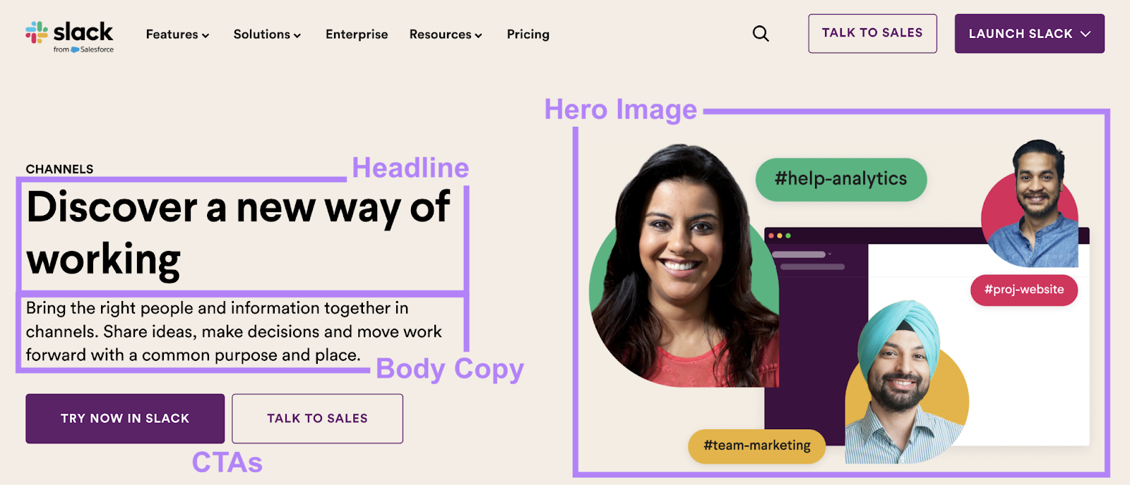
Some key areas of improvement to focus on are the headline, the hero image, the main message in the body copy, the call to action (CTA) button, and the overall design.
Why Is Landing Page Optimization Important?
Optimizing your landing pages helps you get better results from your online marketing efforts. Because good landing pages can turn more visitors into leads and customers.
This means your company could make more money from the same amount of traffic—making each visitor more valuable.
Optimized pages also give visitors a better user experience (UX). Because it ensures they’re able to easily navigate the page, find what’s most interesting to them, and take the next step.
That makes a strong first impression. And those visitors may be more likely to trust your business as a result.
8 Landing Page Optimization Best Practices
To maximize your landing pages’ impact, follow these best practices:
1. Understand Your Target Audience
Knowing who your target audience is helps you create landing page content that speaks directly to them. And is more likely to resonate with the specific group of people you want to attract and convert on your landing page.
So, think about who these people are.
What’s their demographic and socioeconomic background? What are they looking for when they come to your page?
Use Semrush’s One2Target tool to learn about your audience.
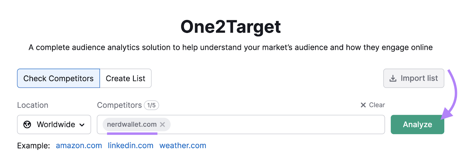
Open the tool, enter a top competitor’s domain, and click “Analyze.”
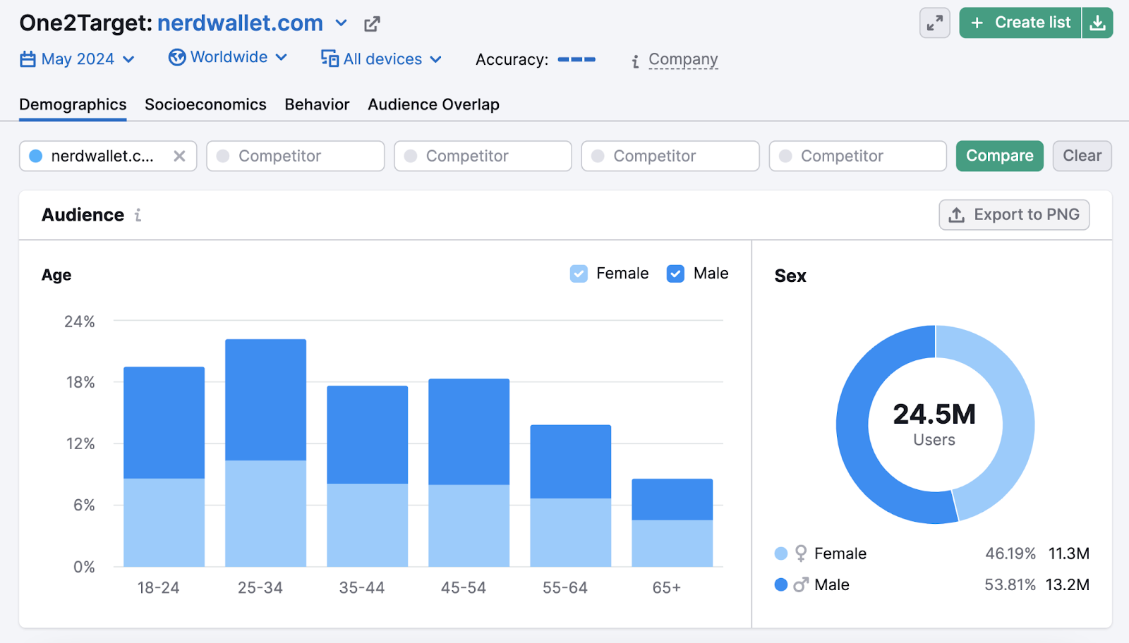
You’ll get a lot of different information about this audience.
In the “Demographics” section, you’ll find information about their age and gender.
In the “Socioeconomics” section, you’ll find details about household size, income level, employment status, and educational background.
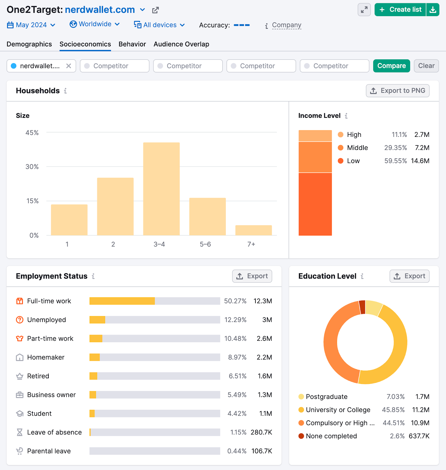
This data can help you determine the language, images, and offers that are most likely to resonate with your target audience.
For example, if your audience is working professionals, you might use a more formal tone and include visuals that convey what your product or service is.
And if your audience has a higher income level, you might focus on premium features and quality (as opposed to emphasizing value for their money and overall affordability).
2. Streamline Conversions
Making it easier for visitors to complete your desired action can lead to more conversions. And better business results.
To streamline conversions, first identify the main action you want visitors to take (signing up for something, making a purchase, etc.).
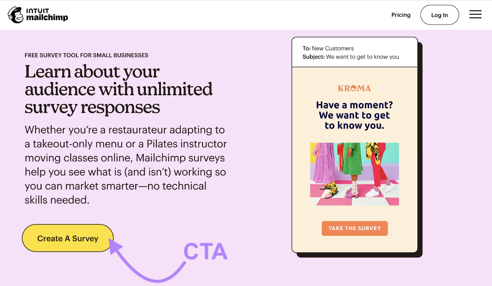
Then, make sure your CTA addresses the action directly. And place it prominently, so it’s easy to see and use.
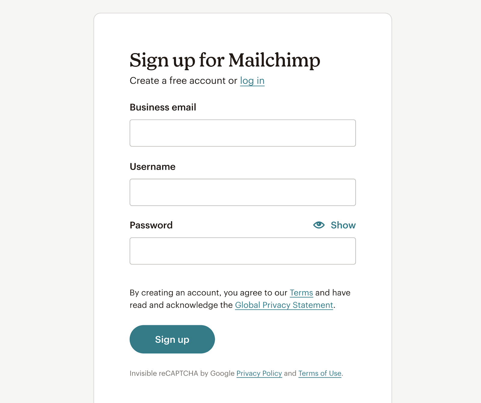
For example, look at how Mailchimp has incorporated a call to action in this landing page.
And if converting requires multiple steps, guide visitors through them smoothly. By using clear instructions and visual cues that show them what to do next.
If you’re using a form (such as sign-up forms or download forms), consider reducing form fields to only what’s absolutely necessary. Because the fewer fields visitors have to fill out, the more likely they are to complete the form.
Lastly, test your conversion process to make sure it works well on all devices. One that’s easy on a computer but hard on a phone can mean missing out on conversions via mobile.
3. Prioritize Above-the-Fold Content
Above the fold refers to the part of your landing page that visitors see without scrolling. And it makes a critical first impression that informs whether users stay or leave.
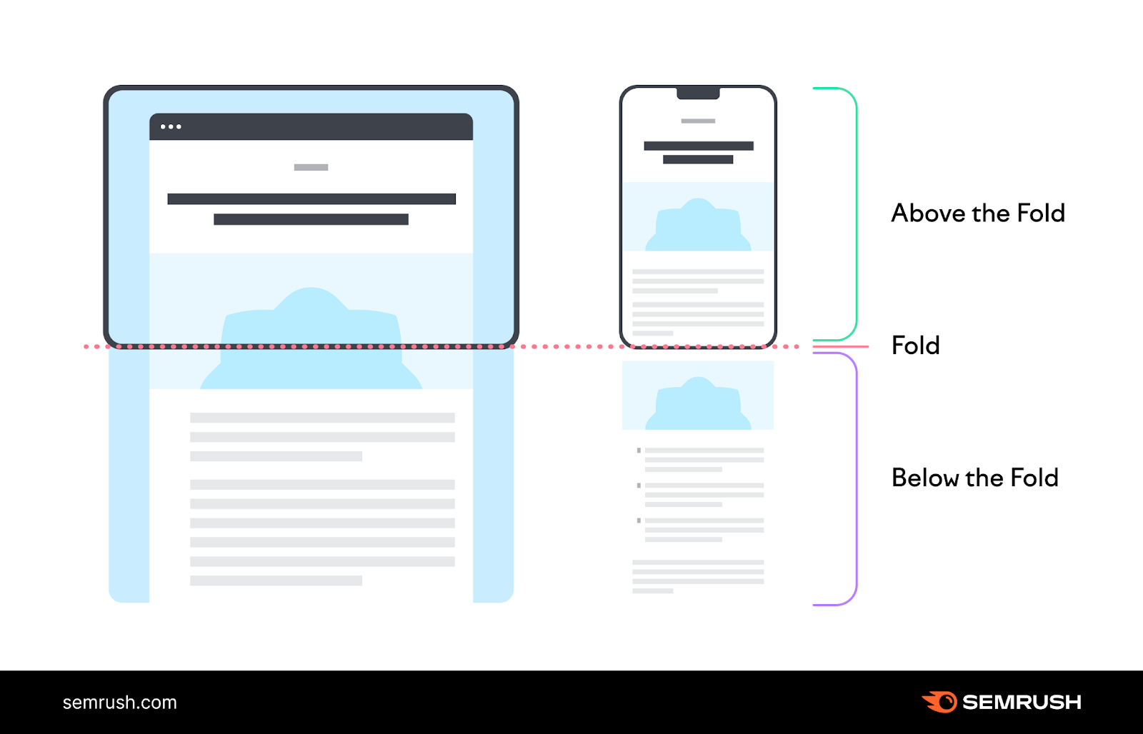
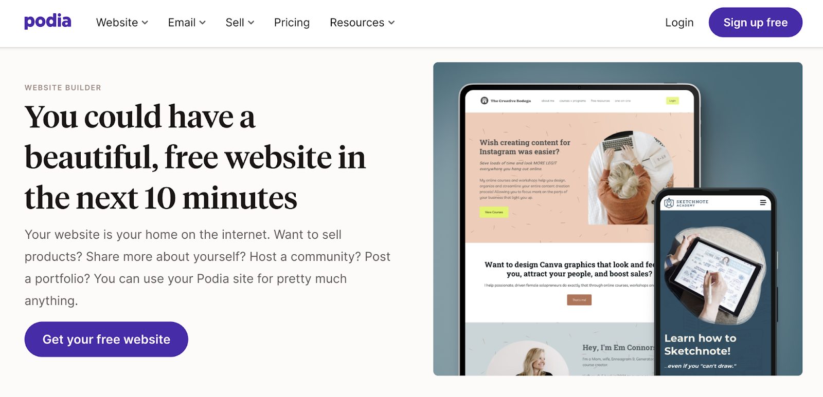
To optimize this space, start with a clear and compelling headline that tells visitors what your offer is and why they should care. And use language that speaks directly to your target audience’s needs or wants.
Then, you can (optionally) include a brief but powerful description providing more context directly under the headline. Which might highlight the main benefits or features.
Place your main CTA somewhere close by—where it’s easy to see. Make sure it stands out visually and clearly states what will happen when clicked.
And use high-quality, relevant images or videos that support your message. Which can help grab attention and help users quickly understand your offer.
Keep the design clean and uncluttered. Because too much information or too many distracting elements can overwhelm visitors and cause them to leave.
Look at the example landing page below for inspiration.
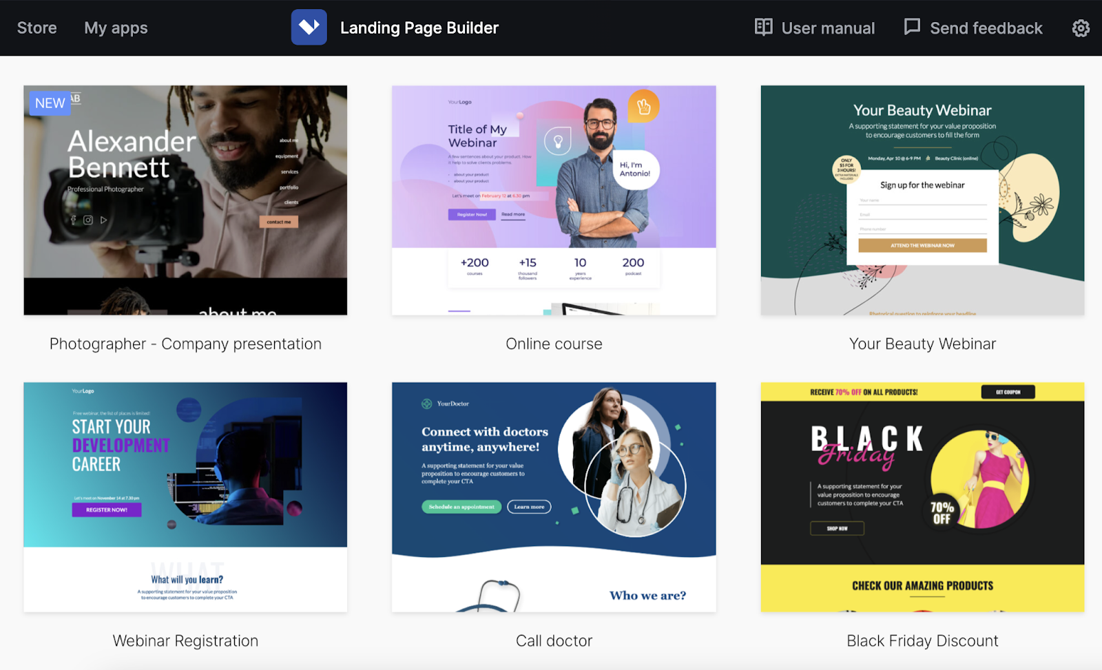
Use the Landing Page Builder app to ensure your above-the-fold content grabs users’ attention.
It comes with tons of templates that are designed with all these best practices in mind.
4. Align Your Content with Users’ Expectations
When people click on a link to your landing page, they have certain expectations based on how they got there. And meeting those expectations can help your page perform better.
Start by thinking about where your visitors are coming from. If they clicked an ad, your landing page should match the ad’s message and offer.
For example, look at this ad promoting coffee subscriptions.
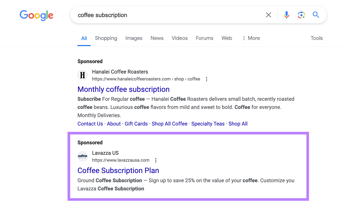
If you click on this ad, you’re taken to a landing page that directly addresses the promise made in the ad—25% savings by signing up for a subscription.
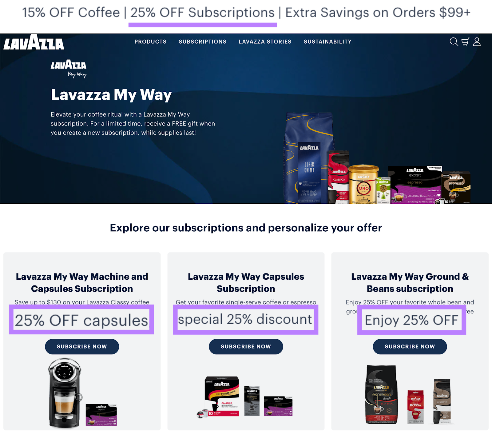
This alignment between the ad and the landing page ensures that visitors find what they expected. Increasing the likelihood they’ll engage with the content and take the desired action.
Also, provide any additional information visitors need to make a decision. This might include product or service details, pricing, or answers to common questions.
5. Improve Key Page Elements
Certain elements can significantly impact your landing page’s performance. Let’s examine these and how to optimize them.
CTA Buttons
CTA buttons prompt visitors to take your desired action by clicking. Whether it’s making a purchase, signing up for a newsletter, or requesting more information.
And well-designed call to action can significantly increase your conversion rate.
Best practices for CTAs include:
- Making them stand out visually with contrasting colors or larger text
- Using action-oriented words that create a sense of urgency. Like “Get Started Now” or “Claim Your Free Trial.”
- Placing CTAs strategically throughout the page, especially on longer pages
- Making sure the buttons are easy to click or tap, especially on mobile devices
Images
Including visuals that complement your text can quickly convey information and evoke emotions. So, they can impact whether visitors convert.
Best practices for images include:
- Using high-quality, relevant images that convey meaning
- Avoiding generic stock photos that don’t add value
- Making sure images load quickly to avoid slowing down your page.
- Using alt text (HTML that briefly describes the image) to improve accessibility and visibility in search results
Trust Indicators
Trust indicators are elements like testimonials, reviews, and badges that build credibility and reassure visitors about your offer. And they increase the likelihood of conversion.
Here’s how you can incorporate trust indicators on your landing pages:
- Display logos of well-known clients or partners—if you have them
- Show security credentials if you collect sensitive information from users
- Include any relevant awards your company has received
- Provide clear contact information, so visitors know they can reach you if needed
6. Use SEO Best Practices
SEO is the practice of optimizing a website or webpage to increase its organic (unpaid) search engine visibility and traffic. Which can drive more traffic and conversions compared to using paid ads alone.
Your landing page should have one primary keyword (the main keyword) you want to target. And you should use this keyword in the:
- Title tag: The title of your landing page that Google may show in search results
- Meta description: The brief description that might appear below your title in search results
- H1 tag: The main heading on your landing page
- URL slug: The last portion of your URL that identifies your landing page
- Body copy: The body content of your landing page
Use Semrush’s On Page SEO Checker to check if your landing pages are well-optimized.
Set up a project in the tool, making sure to manually add all your landing pages with the manual options.
Then, go to the “Optimization Ideas” section to see a list of the pages you specified that need improvement.
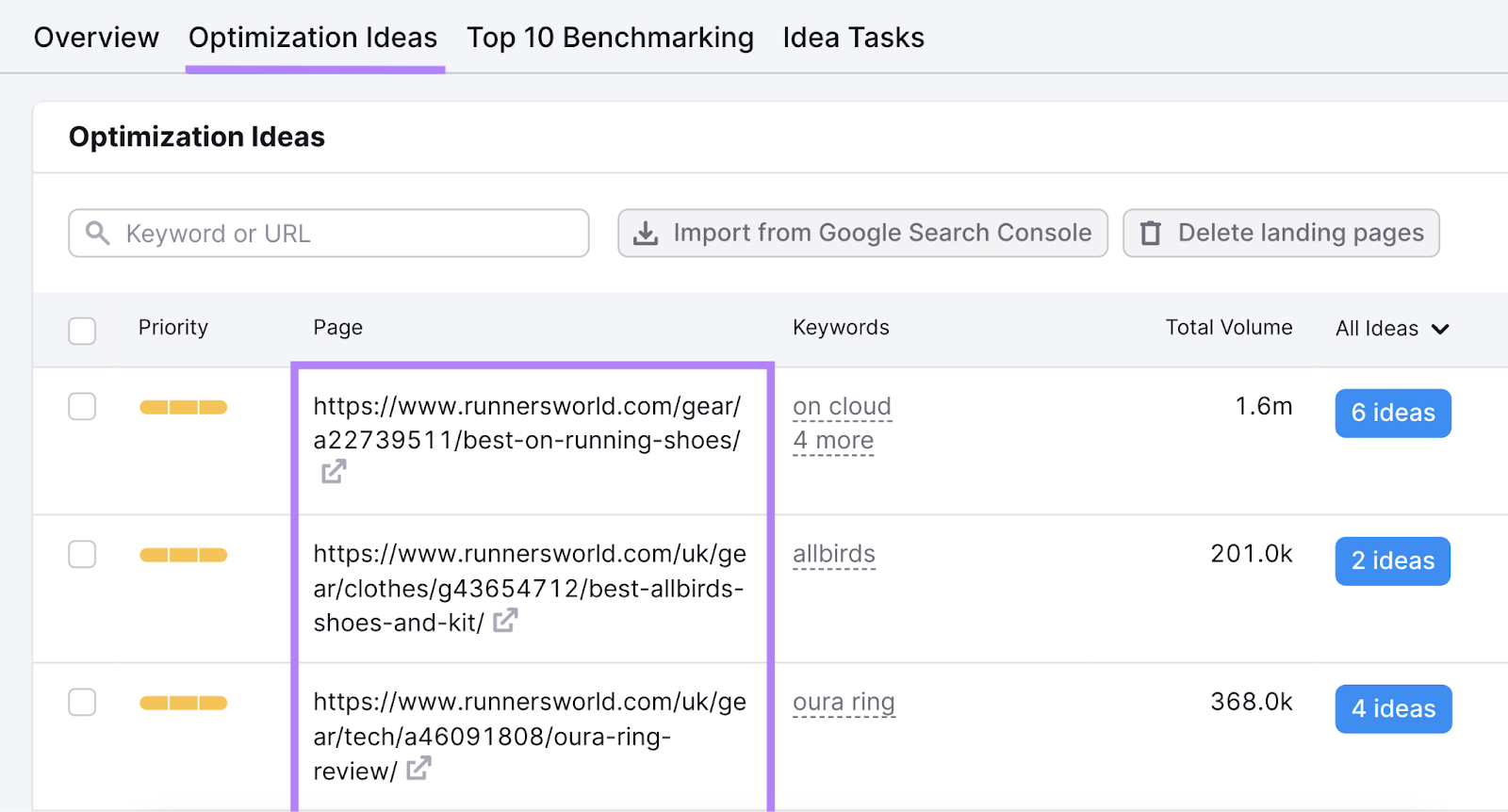
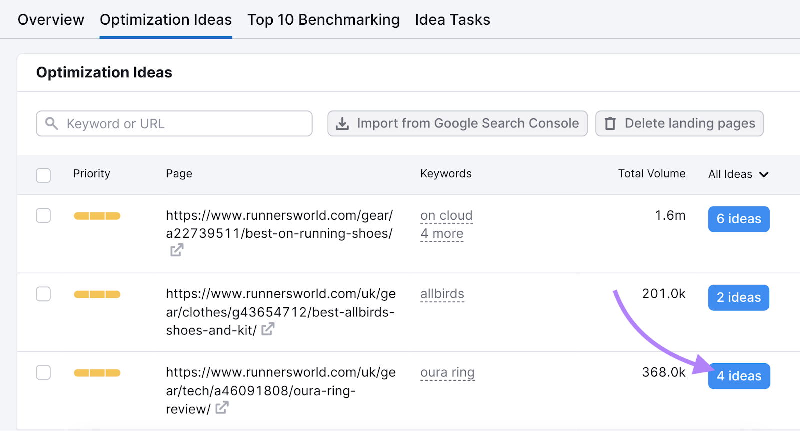
Find one of the landing pages you’re working on and click on the “# ideas” button next to it.
Scroll down to the “Content” section, and you’ll see whether that page is optimized for its target keyword.
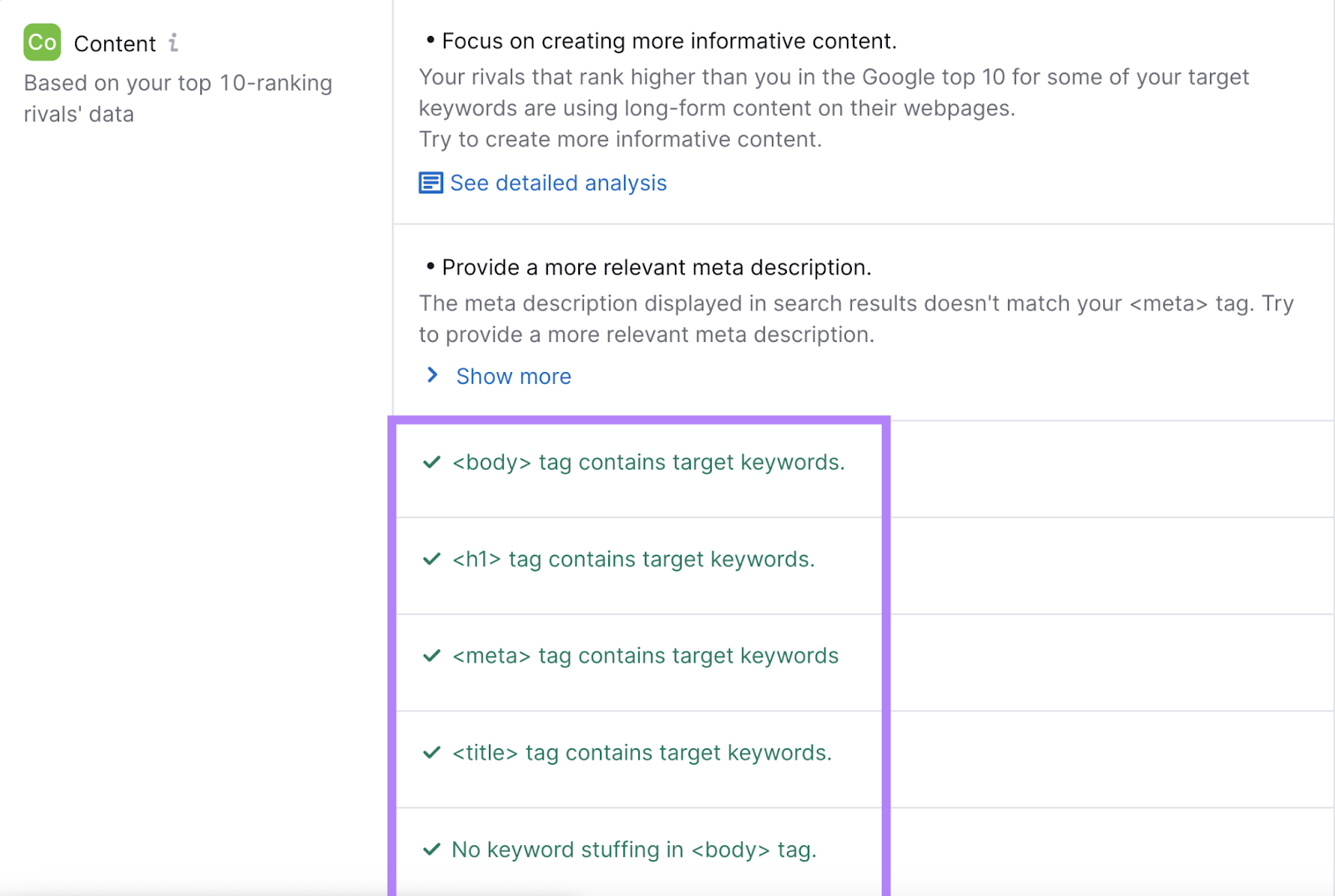
Implement the suggested changes. And repeat this process for your other landing pages.
7. Improve Page Speed
A slow landing page can frustrate visitors and result in them leaving before seeing your offer. And can negatively affect your SEO.
Use Site Audit to see if your pages are fast enough.
Set up a Site Audit project, making sure to crawl the section(s) where your landing pages are located when configuring the “Allow/disallow URLs” section.
When the audit is complete, go to the “Issues” tab and search “speed.”
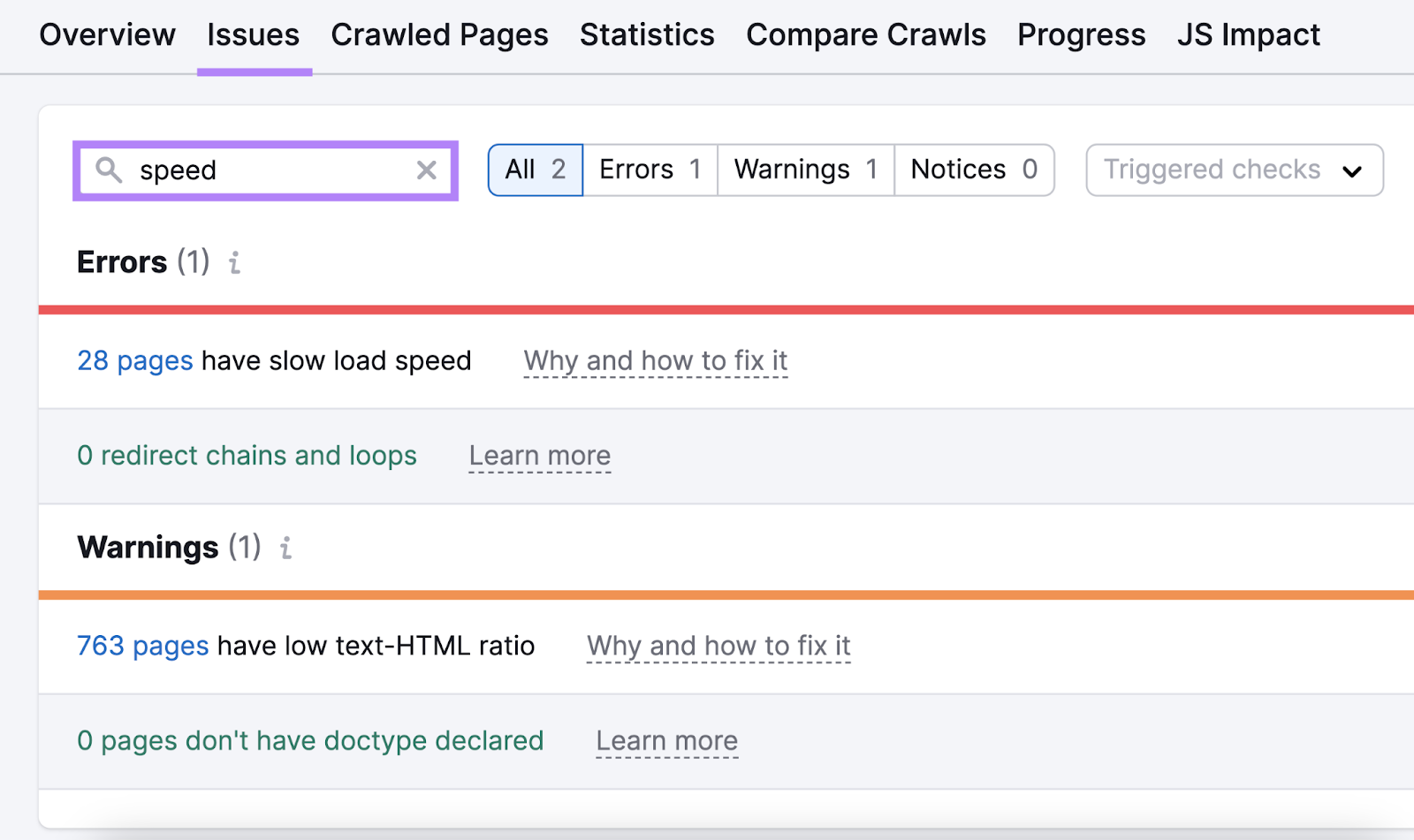
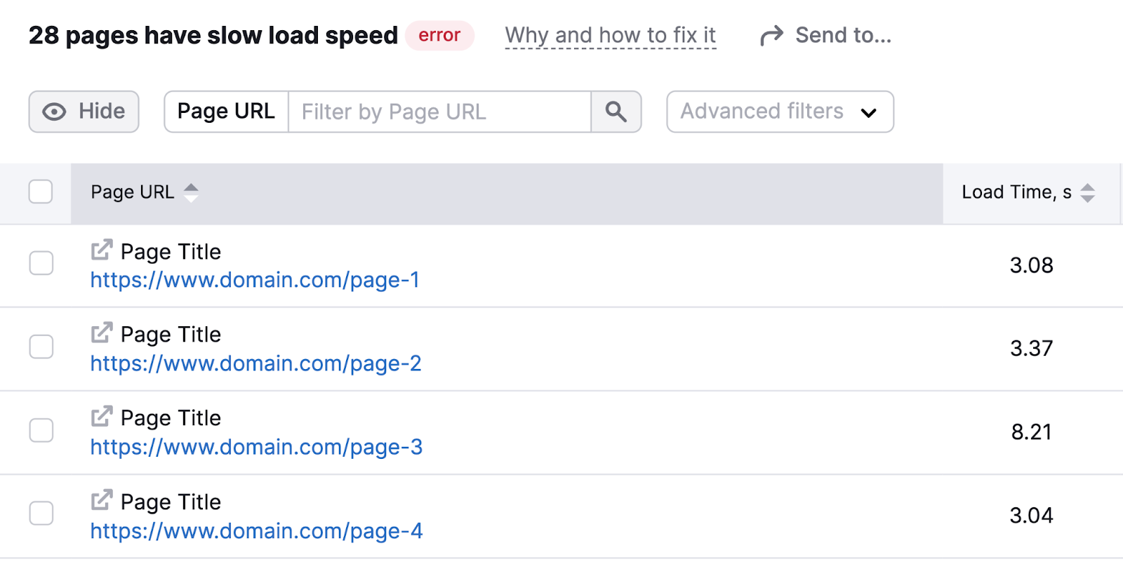
If you see the “# pages have slow load speed” issue, click the number to see whether any of your landing pages are affected.
Here are a few ways you can improve page speed:
- Optimize your images by compressing them. Large image files are often the biggest culprit in slow page speeds.
- Minimize your code by removing unnecessary spaces, comments, and formatting. This can make your HTML, CSS, and JavaScript files smaller and quicker to load.
- Use browser caching to store some data on visitors’ devices. This means repeat visitors will experience faster load times.
- Consider using a content delivery network (CDN). This can speed up your page for visitors who are geographically far from your server.
- Reduce the number of plugins or scripts you’re using. Each one adds load time, so only keep the ones that are truly necessary.
- If you’re using video, consider hosting it on YouTube or Vimeo. Doing this can significantly improve load times compared to hosting it directly on the landing page.
8. Leverage A/B Testing
A/B testing (also known as split testing) is a method of comparing two versions of your landing page to see which one performs better.
It’s a powerful way to make data-driven decisions about your page design and content.
Start by identifying elements you want to test. This could be your headline, CTA button, image placement, or any other part of your page.
Then create two versions of your page, changing only a single element you’re testing.
Run your test for long enough to collect enough data. Then, analyze your results to see which version performed better. And stick with the winning version.
It’s easy to do this with Landing Page Builder.
Examples of Optimized Landing Pages
To better understand what effective landing pages look like, let’s examine some examples.
Figma
Figma’s landing page immediately grabs attention with a clear, benefit-focused headline: “Design experiences users love.” Which speaks to their target audience (UX designers and product teams).
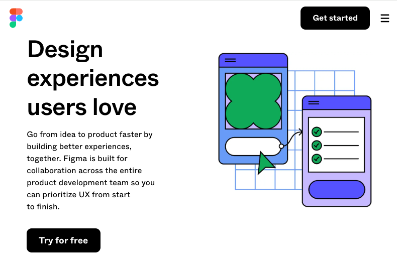
Right below the headline, Figma conveys their value proposition by emphasizing speed, collaboration, and the ability to prioritize UX throughout the product development process.
The CTA button is prominent and above the fold. Making it easy for interested visitors to take the next step.
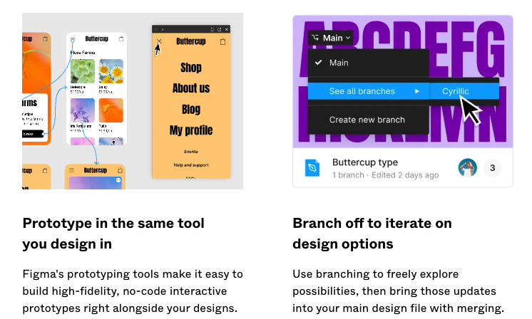
As visitors scroll down, the page highlights key benefits of using Figma. To help potential users understand how the tool can solve their problems and improve their workflows.
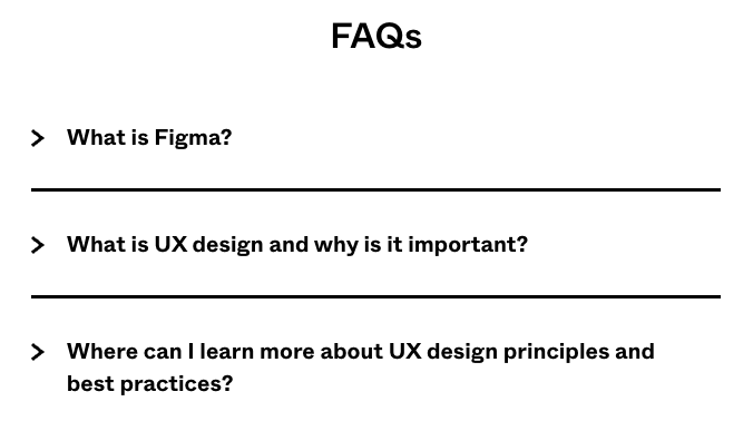
There’s also an FAQ section that addresses common questions or concerns potential customers might have, removing potential barriers to conversion.
SurveyMonkey
SurveyMonkey’s landing page for their survey tool opens with a clear, action-oriented headline that tells visitors what they can do with the tool and how it will benefit them. And the copy just below expands on that promise.
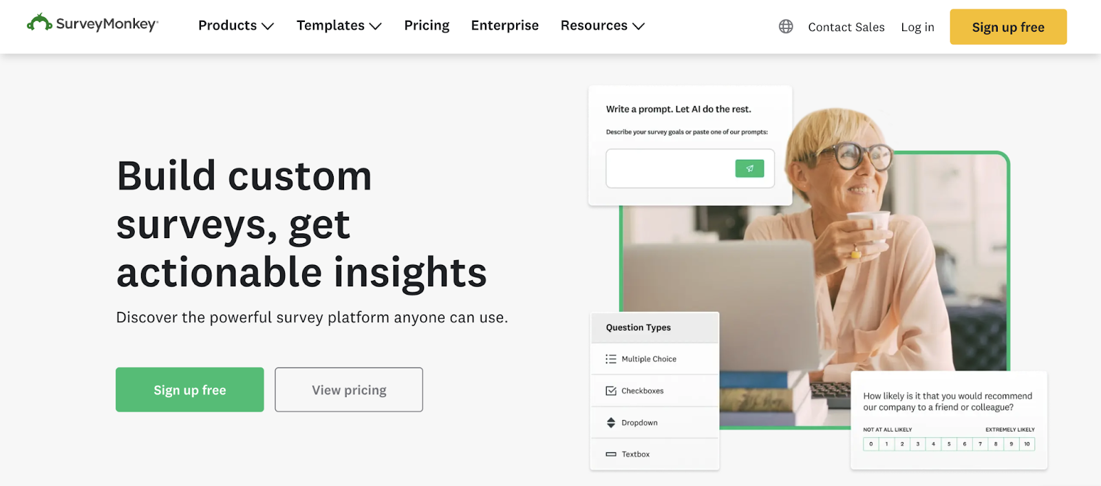
The page features two prominent calls to action:
- “Sign up for free” appeals to those ready to start right away
- “View pricing” caters to visitors who want to explore paid options or compare features across different plans
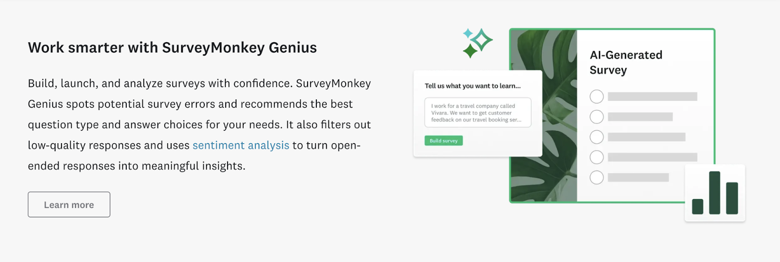
As visitors scroll down, the page highlights specific benefits of using SurveyMonkey. To help potential customers understand different capabilities.
The landing page also features popular companies that use the tool. Which can build trust and credibility. Especially with visitors who might be unsure about trying the tool.
NordVPN
NordVPN’s VPN service landing page opens with a bold headline that positions them as a leader in the market. And the supporting copy just below highlights benefits like privacy, security, etc.
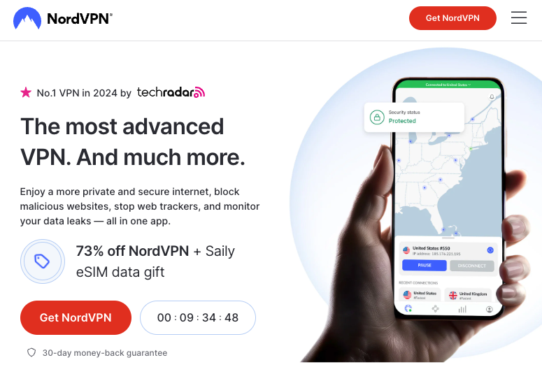
This communicates that NordVPN offers a comprehensive online protection package—not just a simple VPN.
The page prominently displays a running offer of “73% off” alongside the CTA button to create a sense of urgency for potential customers. Which can be a powerful motivator for visitors.
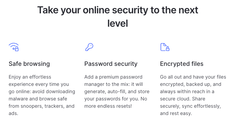
As visitors scroll down, the page highlights various features. To help prospects understand the full range of benefits.
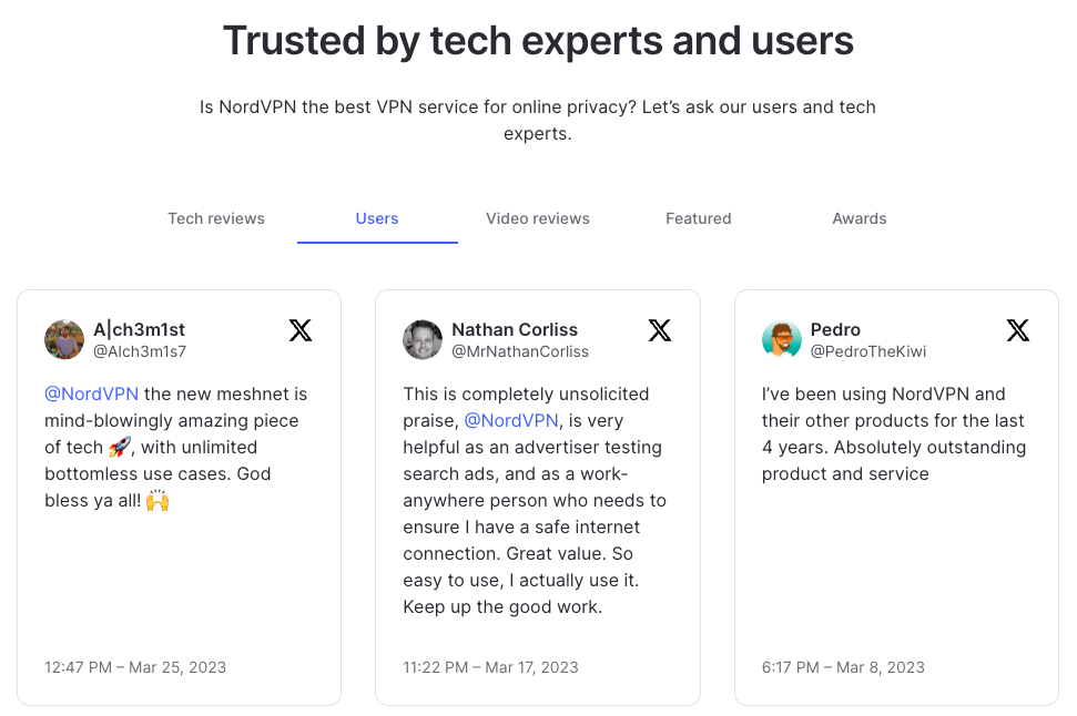
There are also user testimonials to add social proof.
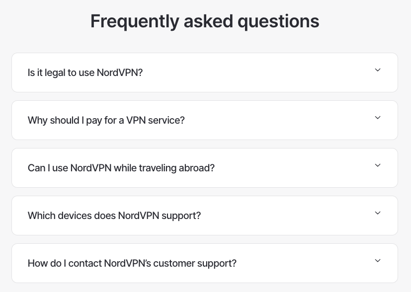
At the end of the page, there’s an FAQ section. Which can help remove potential barriers to signing up.
Start Optimizing Your Landing Pages
By implementing the tips and best practices discussed in this article, you can create more effective landing pages that engage visitors and drive conversions.
So, start optimizing your landing pages using tools like One2Target and On Page SEO Checker.


